Chapter 3 Making Maps in R
Learning Objectives
- plot an sf object
- create a choropleth map with ggplot
- add a basemap with ggmap
- use RColorBrewer to improve legend colors
- use classInt to improve legend breaks
- create a choropleth map with tmap
- create an interactive map with leaflet
In the preceding examples we have used the base plot command to take a quick look at our spatial objects. In this section we will explore several alternatives to map spatial data with R. For more packages see the “Visualization” section of the CRAN Task View.
Mapping packages are in the process of keeping up with the development of the new sf package, so they typically accept both sp and sf objects. However, there are a few exceptions.
Of the packages shown here spplot(), which is part of the good old sp package, only takes sp objects. The development version of ggplot2 can take sf objects, though ggmap seems to still have issues with sf. Both tmap and leaflet can also handle both sp and sf objects.
3.1 Plotting simple features (sf) with plot
As we have already briefly seen, the sf package extends the base plot command, so it can be used on sf objects. If used without any arguments it will plot all the attributes using up to 10 “pretty” breaks. See its document ion by typing ?sf::plot.sf on the console.
# Read Manhattan noise complaints data aggregtated in census tracts
man_noise_rate_sf <-  st_read("./data/nyc/man_noise_rate.shp", quiet = TRUE)
# Read homicides points and transform it to the same CRS as census tract above
man_noises_pt <- sf::st_read('./data/nyc/ManhattanNoise.shp') %>%
  sf::st_transform(sf::st_crs(man_noise_rate_sf));
#> Reading layer `ManhattanNoise' from data source
#> `D:\Cloud_Drive\Hunter College Dropbox\Shipeng Sun\Workspace\RSpace\R-Spatial_Book\data\nyc\ManhattanNoise.shp'
#> using driver `ESRI Shapefile'
#> Simple feature collection with 68582 features and 5 fields
#> Geometry type: POINT
#> Dimension: XY
#> Bounding box: xmin: -74.018 ymin: 40.69889 xmax: -73.90809 ymax: 40.87783
#> Geodetic CRS: WGS 84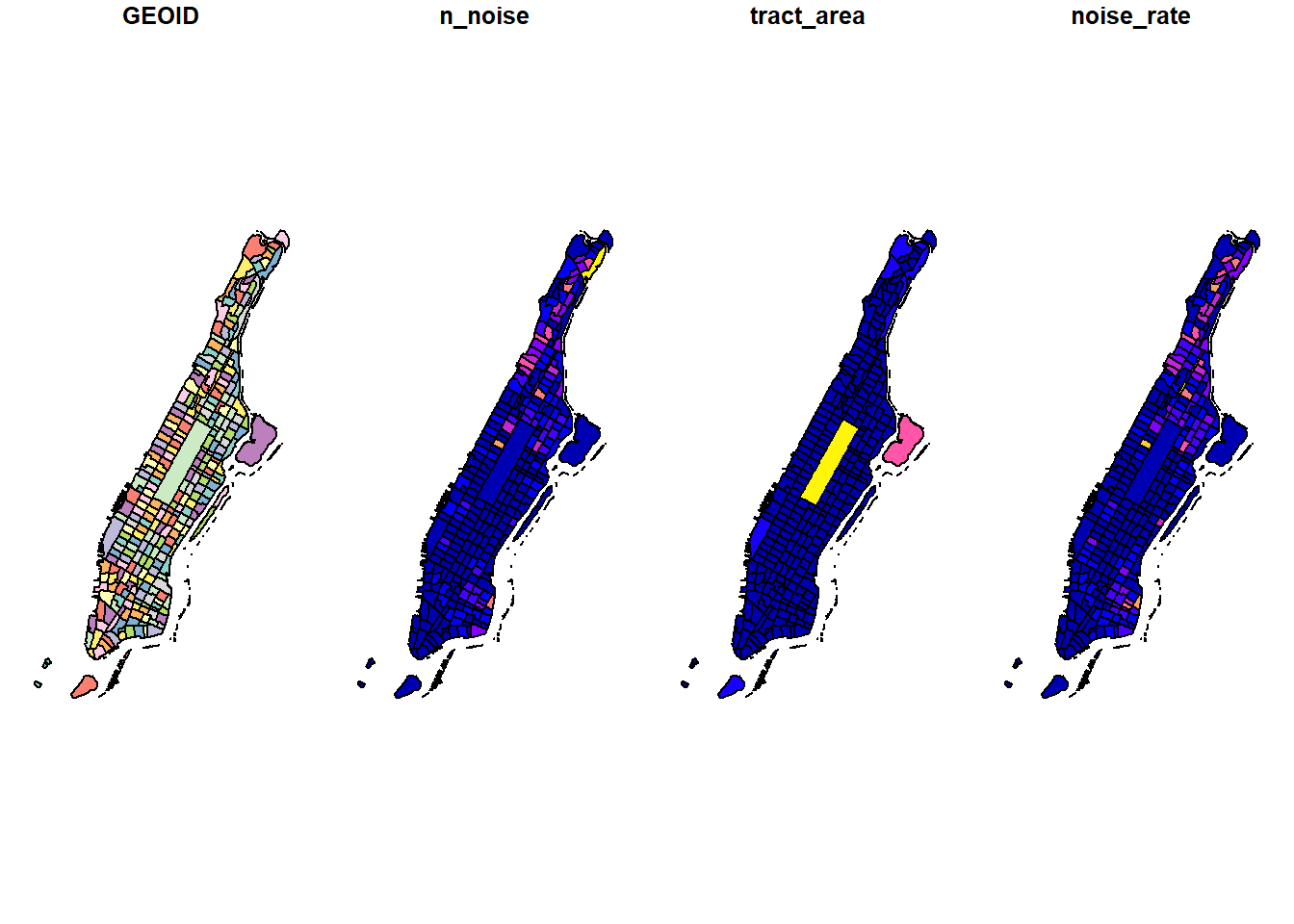
To plot a single attribute we need to provide an object of class sf, like so:
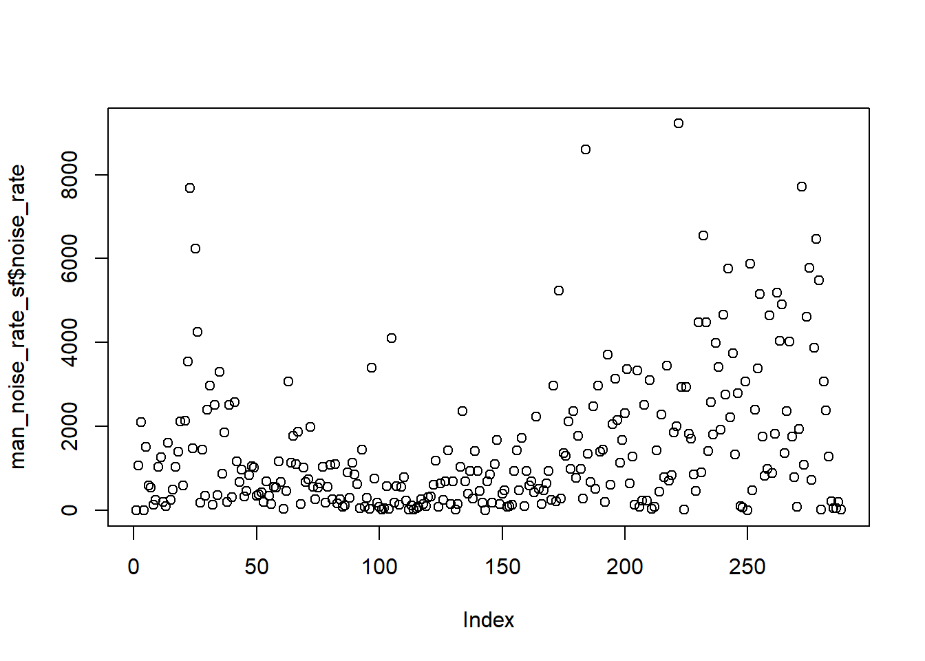
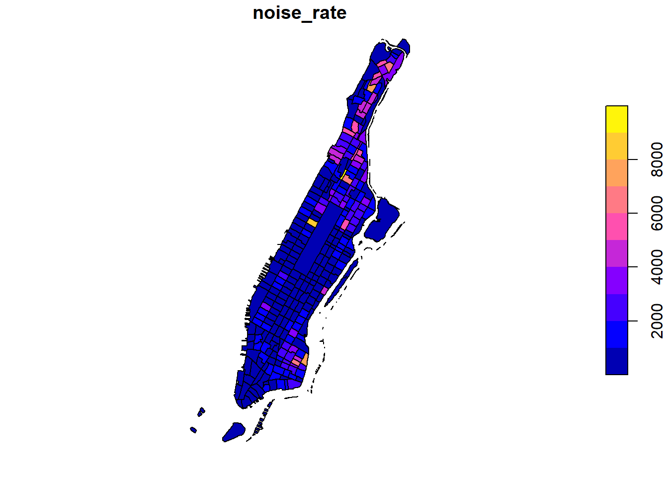
Since our values are unevenly distributed…:
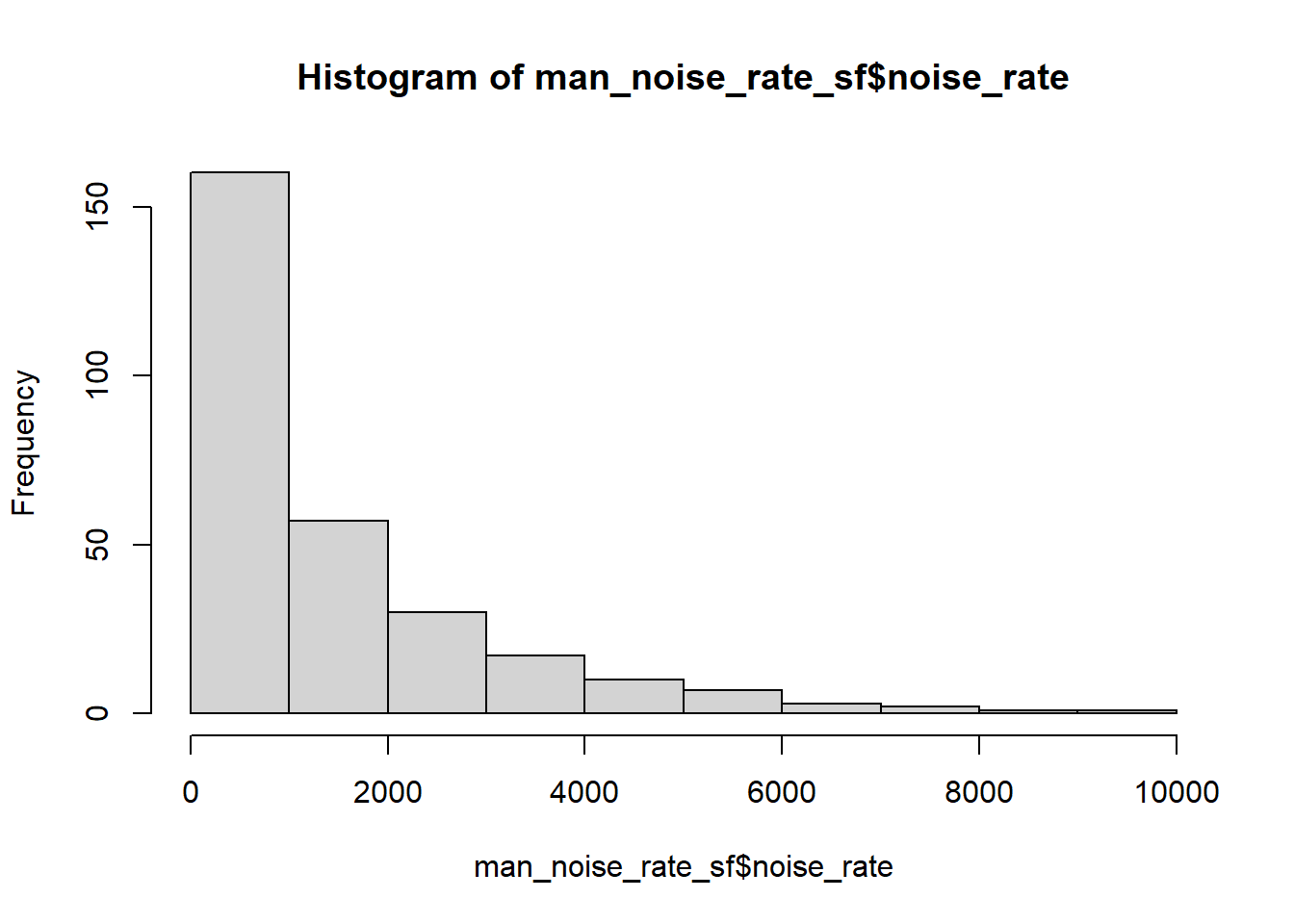
…we might want to set the breaks to quantiles in order to better distinguish the census tracts with low values. This can be done by using the breaks argument for the sf plot function.
plot(man_noise_rate_sf["noise_rate"],
     main = "Manhattan Noise Complaint (per square km)",
     breaks = "quantile",
     border = NA,
     graticule = TRUE)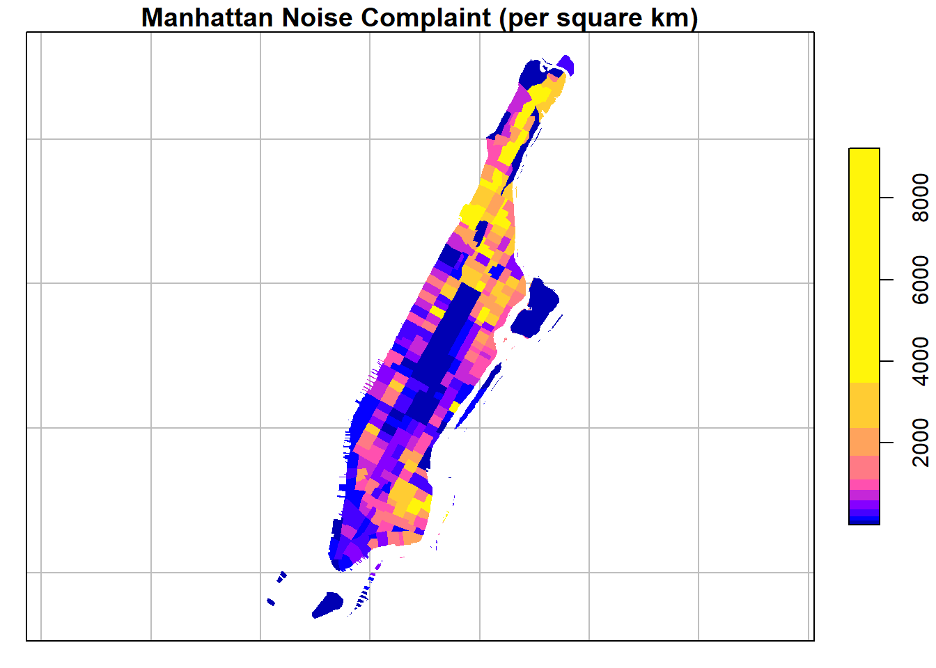
Using the reset=FALSE parameter in the first plot on *sf* object and add=TRUE on following plots, we can plot multiple layers on the map.
ptColor <- rgb(0.1,0.9,0.1,0.1); # r, g, b, and alpha (opaci)
plot(man_noise_rate_sf["noise_rate"],
     main = "Manhattan Noise Complaint (per square km)",
     breaks = "quantile",
     border = NA,
     graticule = st_crs(4326),
     axes=TRUE,
     reset=FALSE)
plot(man_noises_pt["incdnt_z"], pch=19, col=ptColor, cex=0.1, add=TRUE)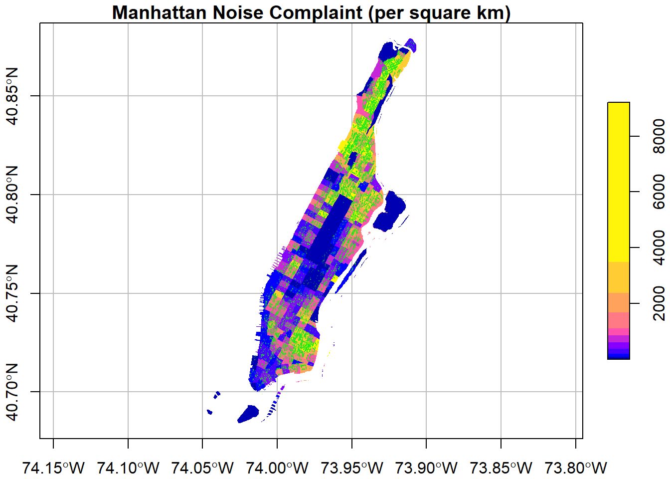
We can change the color palette using a library called RColorBrewer1. For more about ColorBrewer palettes read this.
To make the color palettes from ColorBrewer available as R palettes we use the brewer.pal() function. It takes two arguments: - the number of different colors desired and - the name of the palette as character string.
We select 7 colors from the ‘Orange-Red’ palette and assign it to an object pal.
#> [1] "character"Finally, we add this to the plot
plot(man_noise_rate_sf["noise_rate"],
     main = "Manhattan Noise Complaint per square km",
     breaks = "quantile", nbreaks = 7,
     pal = pal,
     graticule = st_crs(4326),
     axes=TRUE,
     reset=FALSE)
plot(man_noises_pt["incdnt_z"], pch=19, col=ptColor, cex=0.01, add=TRUE)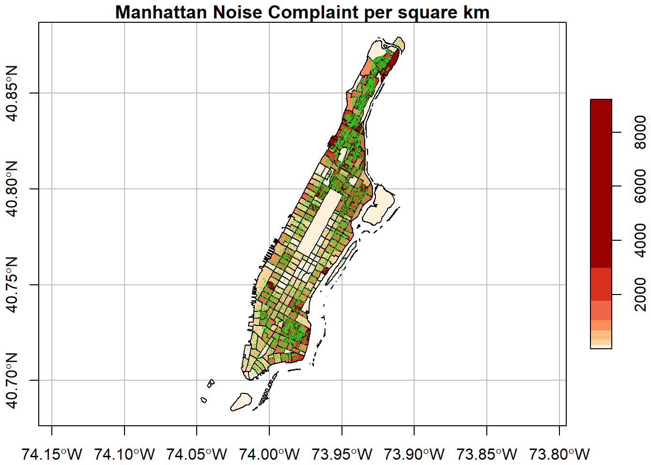
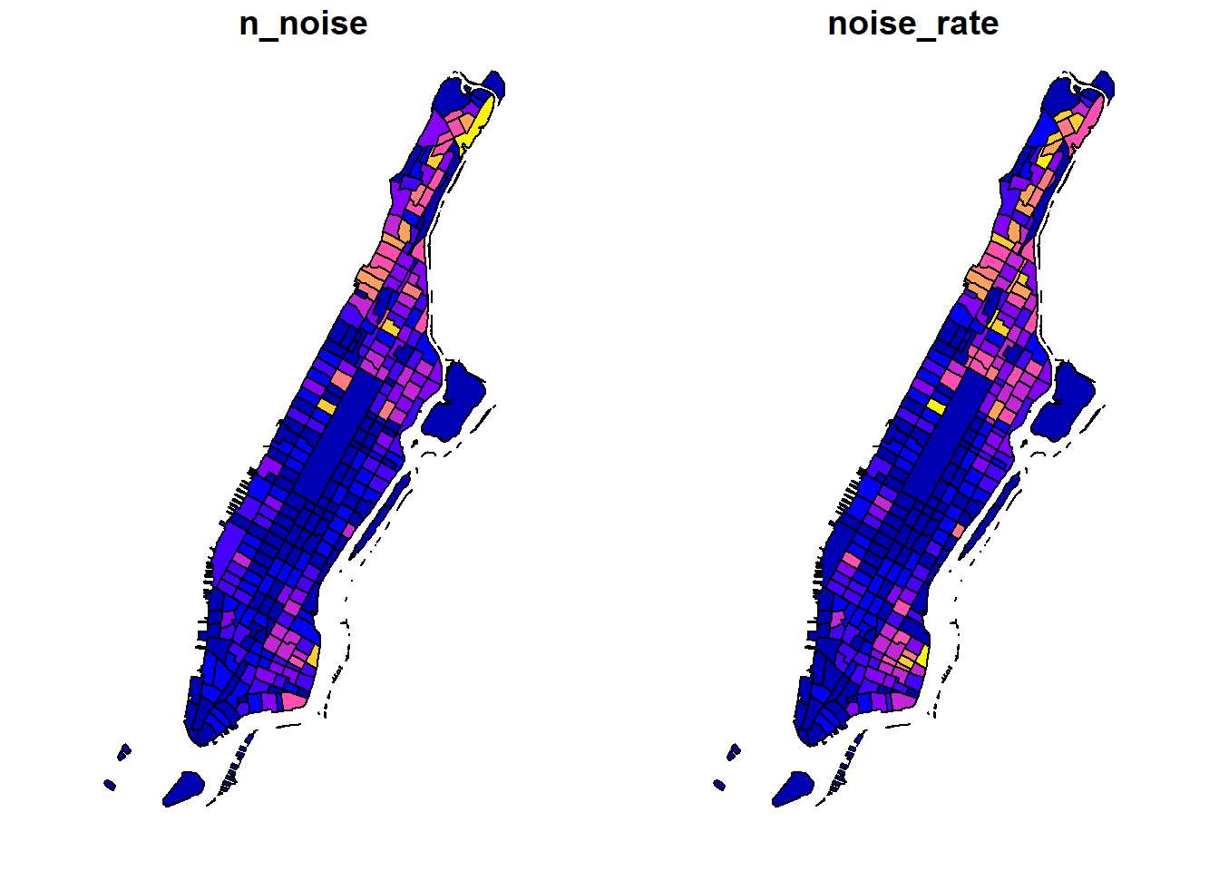
We can also choose to plot multiple columns side by side using plot.sf. But this is only good for simple illustration as it is harder to customize the two plots.
3.2 Choropleth mapping with spplot
sp comes with a plot command spplot(), which takes Spatial* objects to plot. spplot() is one of the earlier functions around to plot geographic objects.
Like plot, by default spplot maps everything it can find in the attribute table. Sometimes this does not work, depending on the data types in the attribute table. In order to select specific values to map we can provide the spplot function with the name (or names) of the attribute variable(s) we want to plot. It is the name of the column of the Spatial*Dataframe as character string (or a vector if several).
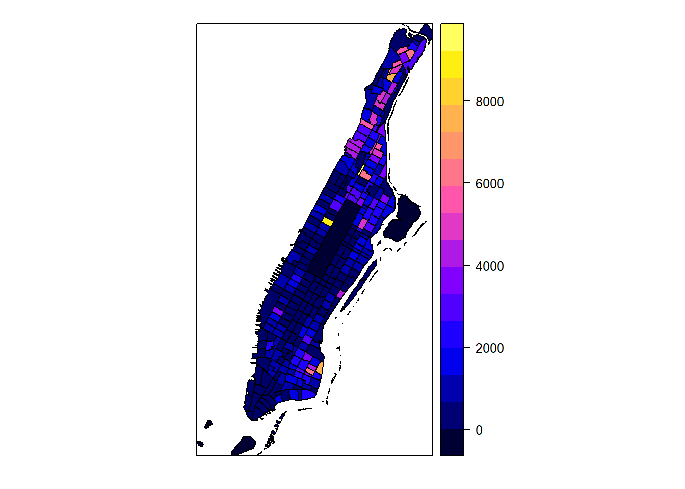
Many improvements can be made here as well, below is an example2 3.
# quantile breaks
require(classInt)
breaks_qt <- classIntervals(man_noise_rate_sf$noise_rate, n = 7, style = "quantile")
br <- breaks_qt$brks %>% as.integer()
offs <- 0.0000001
br[1] <- br[1] - offs
br[length(br)] <- br[length(br)] + offs
# categoreis for choropleth map
man_noise_rate_sf$noise_rate_bracket <- cut(man_noise_rate_sf$noise_rate, br)
# plot
spplot(man_noise_rate_sf %>% sf::as_Spatial(), "noise_rate_bracket", col.regions=pal, main = "Manhattan Noise Complaint Density (per square km)")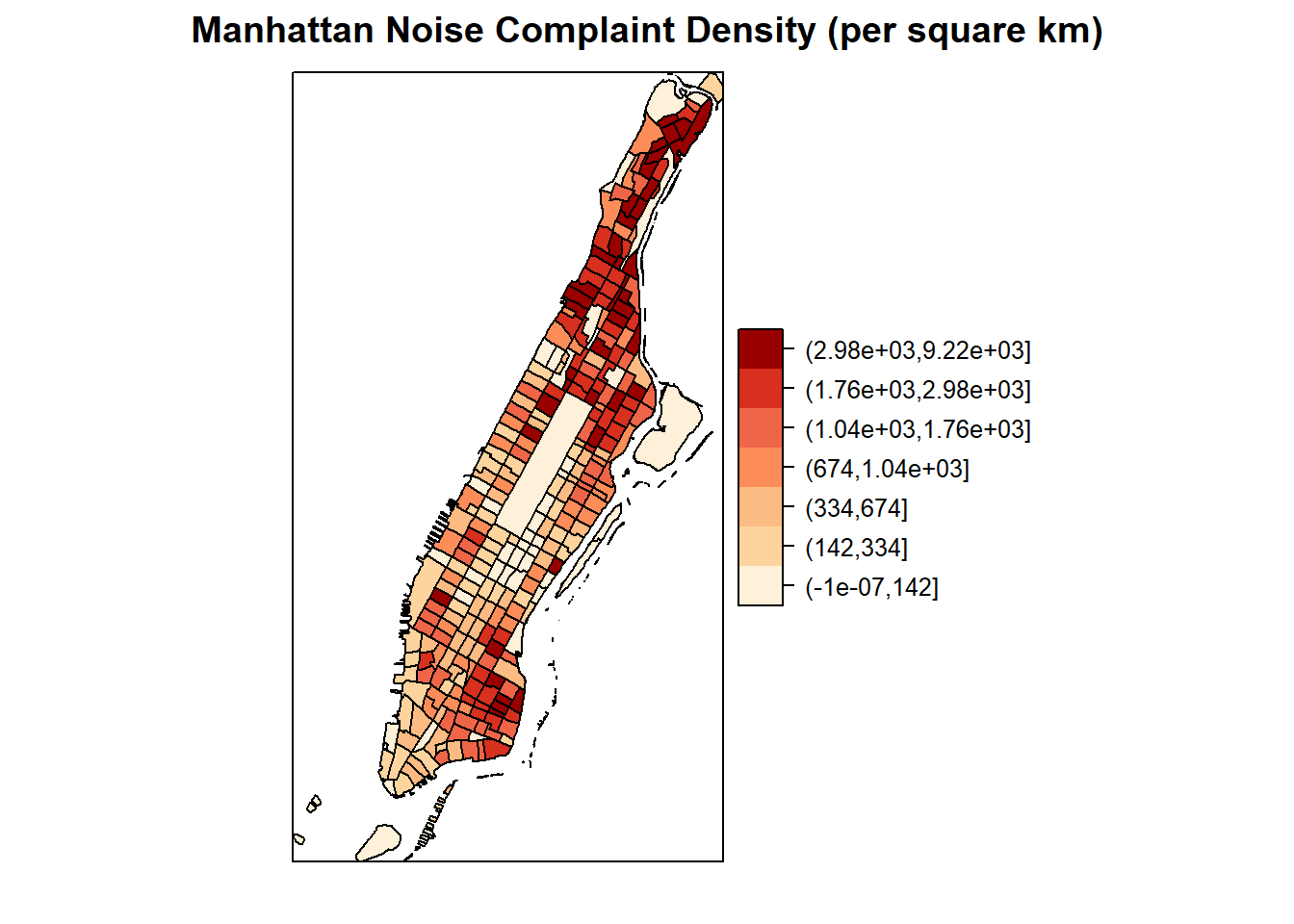
3.3 Choropleth mapping with ggplot2
ggplot2 is a widely used and powerful plotting library for R. It is not specifically geared towards mapping, but one can generate great maps.
As we have learned from previous sections, the ggplot() syntax is different from the previous as a plot is built up by adding components with a +. You can start with a layer showing the raw data then add layers of annotations and statistical summaries. This allows to easily superimpose either different visualizations of one dataset (e.g. a scatterplot and a fitted line) or different datasets (like different layers of the same geographical area)4.
For an introduction to ggplot check out this book by the package creator or this for more pointers.
In order to build a plot you start with initializing a ggplot object. In order to do that ggplot() takes:
- a data argument usually a dataframe and
- a mapping argument where x and y values to be plotted are supplied.
In addition, minimally a geometry to be used to determine how the values should be displayed. This is to be added after an +.
ggplot(data = my_data_frame, mapping = aes(x = name_of_column_with_x_value, y = name_of_column_with_y_value)) +
  geom_point()
Or shorter:
ggplot(my_data_frame, aes(name_of_column_with_x_value, name_of_column_with_y_value)) +
  geom_point()
3.3.1 Basic sf plotting using ggplot
The great news is that ggplot can plot sf objects directly by using geom_sf. So all we have to do is:
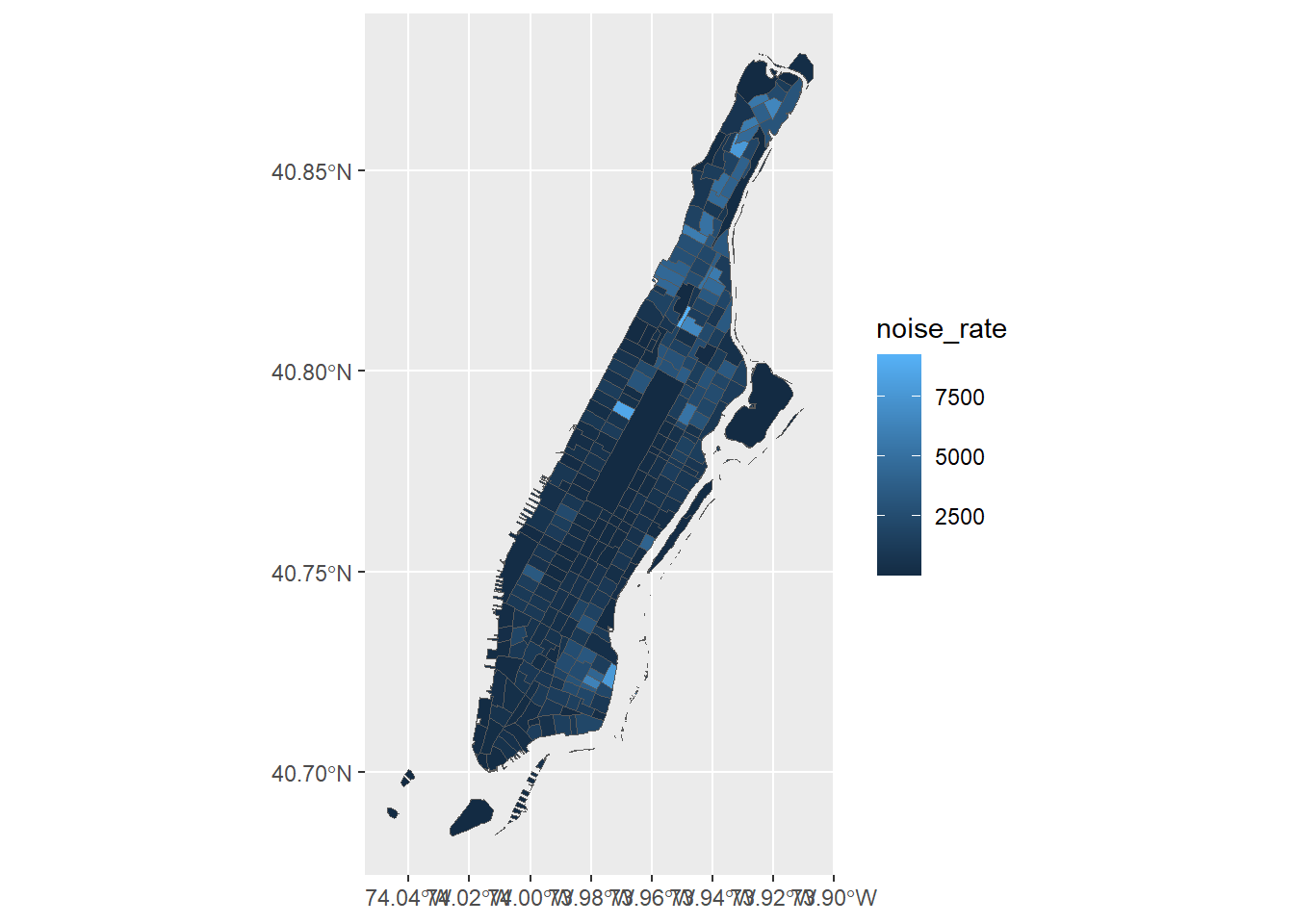
Homicide rate is a continuous variable and is plotted by ggplot as such. If we wanted to plot our map as a ‘true’ choropleth map we need to convert our continuous variable into a categorical one, according to whichever brackets we want to use.
This requires two steps:
- Determine the breaks with a “style”, i.e. the method or algorithm used to categorize data.
- Add a categorical variable to the object which assigns each continuous value to a bracket.
We will use the classInt package to explicitly determine the breaks.
require(classInt)

# get quantile breaks. Add .00001 offset to catch the lowest value
breaks_qt <- classIntervals(c(min(man_noise_rate_sf$noise_rate) - .00001,
                              man_noise_rate_sf$noise_rate), n = 7, style = "quantile")

breaks_qt
#> style: quantile
#> [0.4584908,142.1768) [142.1768,333.1356) [333.1356,656.3473)
#> 42 41 41
#> [656.3473,1039.263) [1039.263,1762.344) [1762.344,2975.877)
#> 41 41 41
#> [2975.877,9217.026]
#> 42OK. We can retrieve the breaks with breaks$brks.
We use cut to divide noise_rate into intervals and code them according to which interval they are in.
Lastly, we can use scale_fill_brewer and add our color palette.
man_noise_rate_sf <- mutate(man_noise_rate_sf,
                            noise_rate_cat = cut(noise_rate, breaks_qt$brks,
                                                 dig.lab = 4, digits=1))

ggplot(man_noise_rate_sf) +
  geom_sf(aes(fill=noise_rate_cat)) +
  scale_fill_brewer(palette = "OrRd", name='Per SQKM') +
  coord_sf(xlim = c(-74.06, -73.85), default_crs = sf::st_crs(4326) ) +
  labs(x='Longitude', y='Latitude',
       title='Manhattan Noise Complaint Rate',
       caption = 'Data Source: NYC OpenData') +
  theme(legend.position = "right")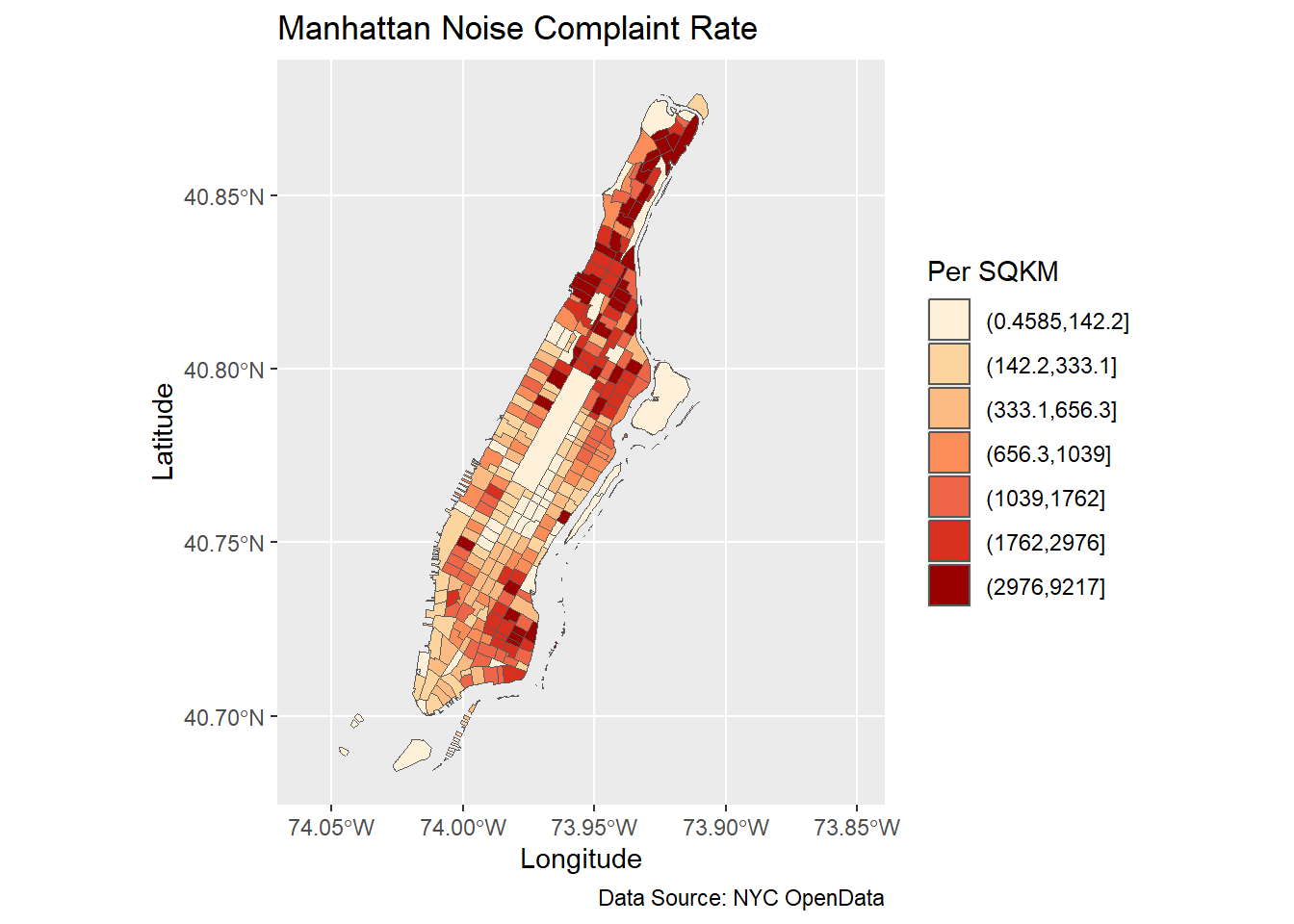
3.3.2 Multi-layer plotting
Similarly, we can add multiple layers to the ggplot.
ggplot(man_noise_rate_sf) +
  geom_sf(aes(fill=noise_rate_cat)) +
  geom_sf(data=man_noises_pt, colour=ptColor, size=0.01) +
  scale_fill_brewer(palette = "OrRd", name='Noise Complaint Per SQKM') +
  coord_sf(xlim = c(-74.06, -73.85), default_crs = sf::st_crs(4326) ) +
  labs(x='Longitude', y='Latitude',
       title='Manhattan Noise Complaint Rate',
       caption = 'Data Source: NYC OpenData, US Census');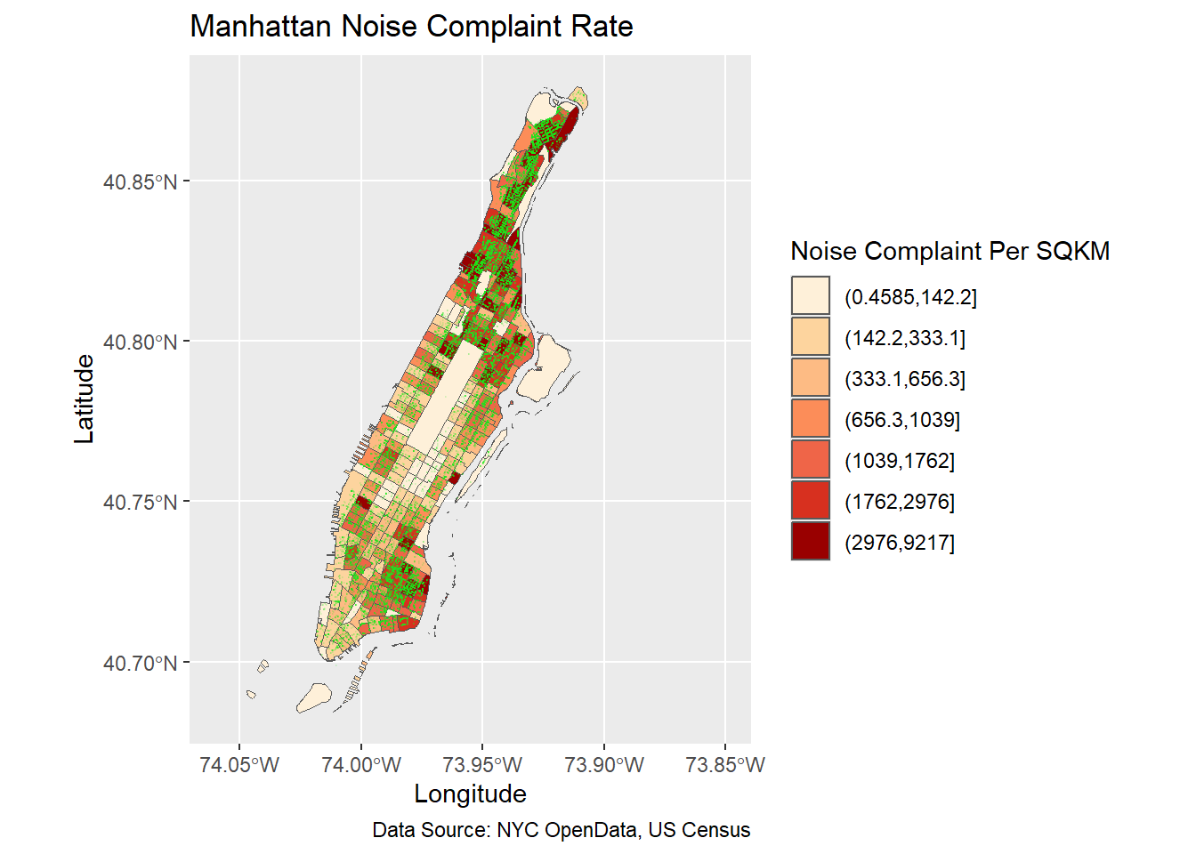
3.3.3 Label spatial objects
With geom_sf_text and geom_sf_label functions, we can add labels to mapped spatial objects. geom_sf_label draws a rectangle behind the text, therefore making good contrast. As in other GIS software, labeling is complicated because there would be many conflicts among labels. The results of automatic labeling is rarely satisfactory and up to the standard of cartography or academic publication. Even though packages like ggrepel greatly help avoid overlapping labels, manual adjustments are often necessary and preferred.
ggplot(man_noise_rate_sf) +
  geom_sf(aes(fill=noise_rate_cat)) +
  geom_sf(data=man_noises_pt, colour=ptColor, size=0.1) +
  geom_sf_label(data = man_noise_rate_sf %>% dplyr::filter(n_noise > 1000),
                aes(label = n_noise),
                label.size = .09,
                size = 3) +
  scale_fill_brewer(palette = "OrRd", name='Homicide Per SQKM') +
  coord_sf(xlim = c(-74.06, -73.85), default_crs = sf::st_crs(4326) ) +
  labs(x='Longitude', y='Latitude',
       title='Manhattan Noise Complaint Rate',
       caption = 'Data Source: [...]');
#> Warning: The `label.size` argument of `geom_label()` is deprecated as of ggplot2 3.5.0.
#> ℹ Please use the `linewidth` argument instead.
#> This warning is displayed once every 8 hours.
#> Call `lifecycle::last_lifecycle_warnings()` to see where this warning was
#> generated.#> Warning in st_point_on_surface.sfc(sf::st_zm(x)): st_point_on_surface may not
#> give correct results for longitude/latitude data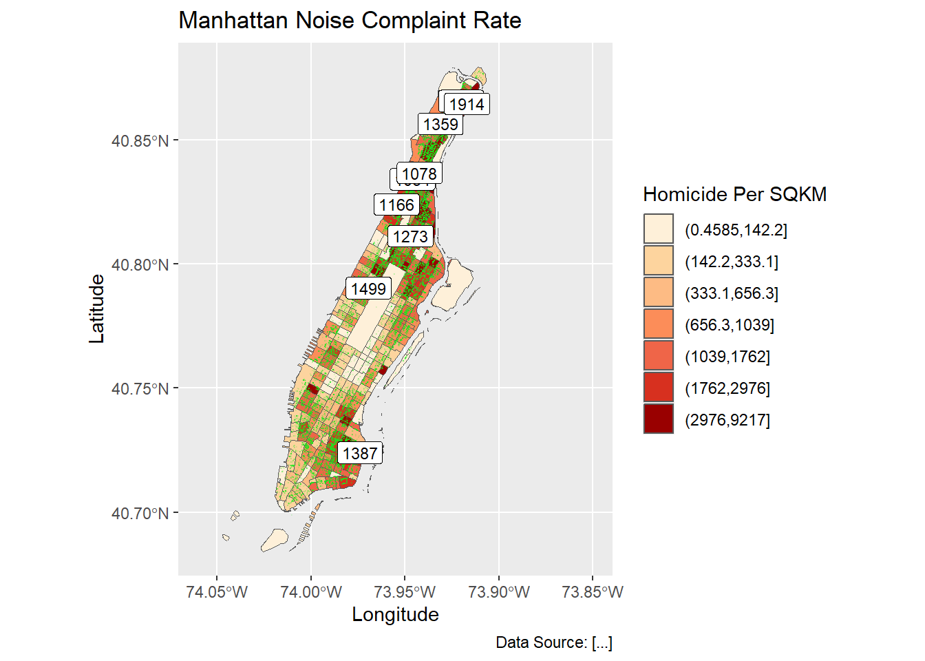
Using ggrepel helps disperse those labels.
require(ggrepel);
labelCoords <- man_noise_rate_sf %>% sf::st_centroid() %>%
  dplyr::filter(n_noise > 1000) %>%
  sf::st_coordinates();

labelData <- man_noise_rate_sf %>% sf::st_centroid() %>%
  dplyr::filter(n_noise > 1000) %>%
  dplyr::mutate(x = labelCoords[,1], y=labelCoords[,2])


ggplot(man_noise_rate_sf) +
  geom_sf(aes(fill=noise_rate_cat)) +
  #geom_sf(data=man_noises_pt, colour=ptColor, size=0.1) +
  geom_label_repel(data = labelData,
                   aes(x=x,y=y,label = n_noise),
                   label.size = .09,
                   size = 3,
                   segment.color = rgb(0.5,0.5,0.9),
                   segment.size = 0.8) +
  scale_fill_brewer(palette = "OrRd", name='Homicide Per SQKM') +
  coord_sf(xlim = c(-74.06, -73.85), default_crs = sf::st_crs(4326) ) +
  labs(x='Longitude', y='Latitude',
       title='Manhattan Noise Complaint Rate',
       caption = 'Data Source: [...]');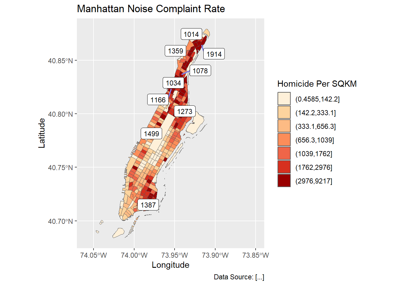
3.3.4 Adding basemaps with ggmap
ggmap builds on ggplot and allows to pull in tiled basemaps from different services, like Google Maps, OpenStreetMaps, or Stamen Maps5.
So let’s overlay the map from above on a terrain map we pull from Stamen.
If you have a valid Google Maps API key, the following method still works. First we use the get_map() command from ggmap to pull down the basemap. We need to tell it the location or the boundaries of the map, the zoom level, and what kind of map service we like (default is Google terrain). It will actually download the tile. get_map() returns a ggmap object, name it man_basemap. In order to view the map we then use ggmap().
Currently, only the Stamen Maps allows R code to retrieve base maps without API keys. And we need to specifically call the function get_stamenmap to acquire the basemap. If we plan to make multiples maps for the same area, it is better to save it to a variable and reuse it.
ggmap does not allow functions without API key for statman, stadia, and google maps. It also has problem with OpenStreetMap. It is recommended to use Leaftlet-based packages like mapview and tmap.
require(ggmap)

# First, register and get an API key from
# https://docs.stadiamaps.com/tutorials/getting-started-in-r-with-ggmap/
register_stadiamaps("YOUR-API-KEY-HERE", write = TRUE)

# We can get a simple basemap. Adjust zoom with the map extent.
# Higher zoom means more details but needs more time to load.
# Start from small and increase to an appropriate level. Will learn more on this.

# In most cases we can use the extent of the data to retrieve the basemap
# Note those services require boundary in geographic coordinates
# and we also want to expand a little bit to completely contain the data ranges.
mapBound <- man_noise_rate_sf %>% sf::st_transform(4326) %>%
  st_bbox() %>% st_as_sfc() %>% st_buffer(0.02) %>%
  st_bbox() %>% as.numeric()

# but for the long shape of Manhattan, it might be better to manually choose the basemap
mapBound <- c(-74.06, 40.682, -73.85, 40.883)

man_basemap <- ggmap::get_stadiamap(bbox = mapBound, zoom = 11, messaging = FALSE, maptype = 'stamen_terrain')

ggmap(man_basemap)
Then we can reuse the code from the ggplot example above, just replacing the first line, where we initialized a ggplot object above
ggplot() + with the line to call our basemap:
ggmap(man_basemap) +We also have to set inherit.aes to FALSE, so it overrides the default aesthetics (from the ggmap object).
ggmap(man_basemap) +
  geom_sf(data = man_noise_rate_sf, aes(fill=noise_rate_cat), inherit.aes = FALSE) +
  scale_fill_brewer(palette = "OrRd")
Note that if the data are in a local map projection, We need to set our CRS to WGS84, which is the one the tiles are downloaded in. We can add coord_sf to do this:
ggmap(man_basemap) +
    geom_sf(data = man_noise_rate_sf, aes(fill=noise_rate_cat), inherit.aes = FALSE) +
    scale_fill_brewer(palette = "OrRd") +
    coord_sf(crs = st_crs(4326))
The ggmap package also includes functions for distance calculations, geocoding, and calculating routes.
3.3.5 Arrange and export plots
As we have learned before, we can plot these maps to an external file using ggsave or ggexport. With ggarrange, we can also make a nice layout of multiple maps. We can also create a better defined device first and the plot maps on that device.
g1 <- ggmap(man_basemap) +
    geom_sf(data = man_noise_rate_sf, aes(fill=noise_rate_cat), inherit.aes = FALSE) +
    scale_fill_brewer(palette = "OrRd") +
    coord_sf(crs = st_crs(4326))

g2 <- ggplot(man_noise_rate_sf) +
  geom_sf(aes(fill=noise_rate_cat)) +
  geom_sf(data=man_noises_pt, colour=ptColor, size=0.1) +
  scale_fill_brewer(palette = "OrRd", name='Noise Complaint Per SQKM') +
  coord_sf(xlim = c(-74.06, -73.85), default_crs = sf::st_crs(4326) ) +
  labs(x='Longitude', y='Latitude',
       title='Manhattan Noise Complaint Rate',
       caption = 'Data Source: [...]');

#===========================================================
# does not run
pdf(file='./img/sf_plot_export.pdf', width = 6.5, height = 8.0);
#plot
g1; g2;
# Turn off the PDF device
dev.off()
#===========================================================require(ggpubr)
g3 <- ggplot(man_noise_rate_sf) +
geom_sf(aes(fill=noise_rate_cat), show.legend = FALSE) +
scale_fill_brewer(palette = "OrRd", name='Noise Complaint Per SQKM') +
coord_sf(xlim = c(-74.06, -73.85), ylim=c(40.68, 40.88), default_crs = sf::st_crs(4326) ) +
labs(x='Longitude', y='Latitude',
title='Manhattan Noise Complaint Rate',
caption = 'Data Source: [...]')+
theme(legend.position = "left");
g4 <- ggplot(man_noises_pt) +
geom_sf(colour=ptColor, size=0.1) +
scale_fill_brewer(palette = "OrRd", name='Noise Complaints') +
coord_sf(xlim = c(-74.06, -73.85), ylim=c(40.68, 40.88), default_crs = sf::st_crs(4326) ) +
labs(x='Longitude', y='Latitude',
title='Manhattan Noise Complaints',
caption = 'Data Source: [...]');
# It is important to set xlim and ylim, so that the maps have the same sizes.
g34 <- ggarrange(g3, g4, nrow = 1, ncol = 2, aligh="v")
# The arranged maps can be exported to a PDF or an image file
#
ggexport(g34, filename = file.path(getwd(), 'img/sf_plot_export_2.pdf'),
width=6.50, height=8.00, # the unit is inch
pointsize = 9)#> file saved to D:/Cloud_Drive/Hunter College Dropbox/Shipeng Sun/Workspace/RSpace/R-Spatial_Book/img/sf_plot_export_2.pdf# The ggarrange output actually has two pages. We only need the first one.
# The second page is empty.
g34[[1]]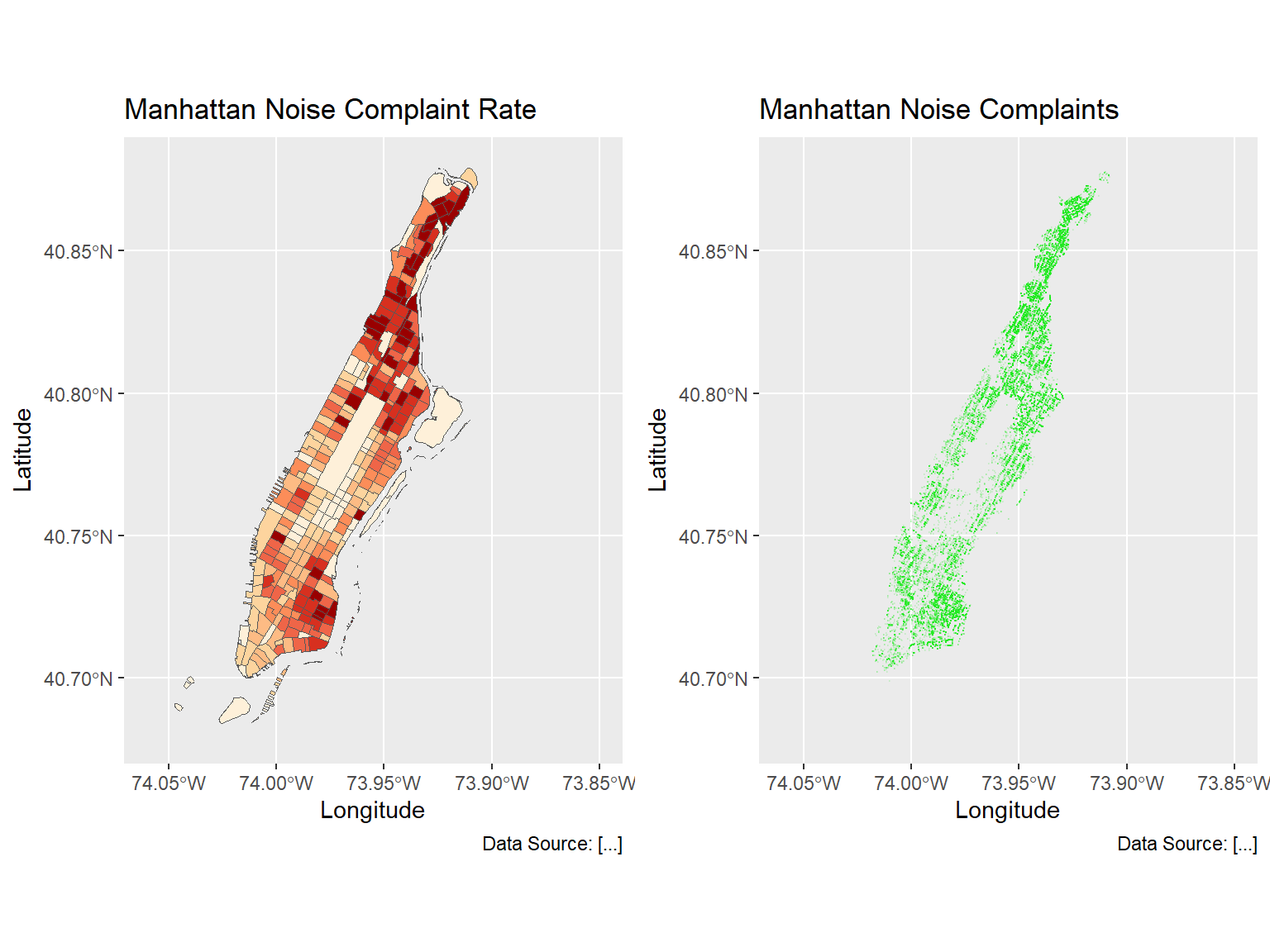
Another good package for arranging ggplot outputs is patchwork, particularly its plot_layout method. It can align plots more precisely than ggarrange. For example, plot_layout makes two maps the same size, regardless of legends or other elements.
g3 <- ggplot(man_noise_rate_sf) +
  geom_sf(aes(fill=noise_rate_cat), show.legend = TRUE) +
  scale_fill_brewer(palette = "OrRd", name='Noise Complaint Per SQKM') +
  coord_sf(xlim = c(-74.06, -73.85), ylim=c(40.68, 40.88), default_crs = sf::st_crs(4326) ) +
  labs(x='Longitude', y='Latitude',
       title='Manhattan Noise Complaint Rate',
       caption = 'Data Source: [...]')+
  theme(legend.position = "bottom");

g3 + g4 + plot_layout(ncol = 2, nrow = 1)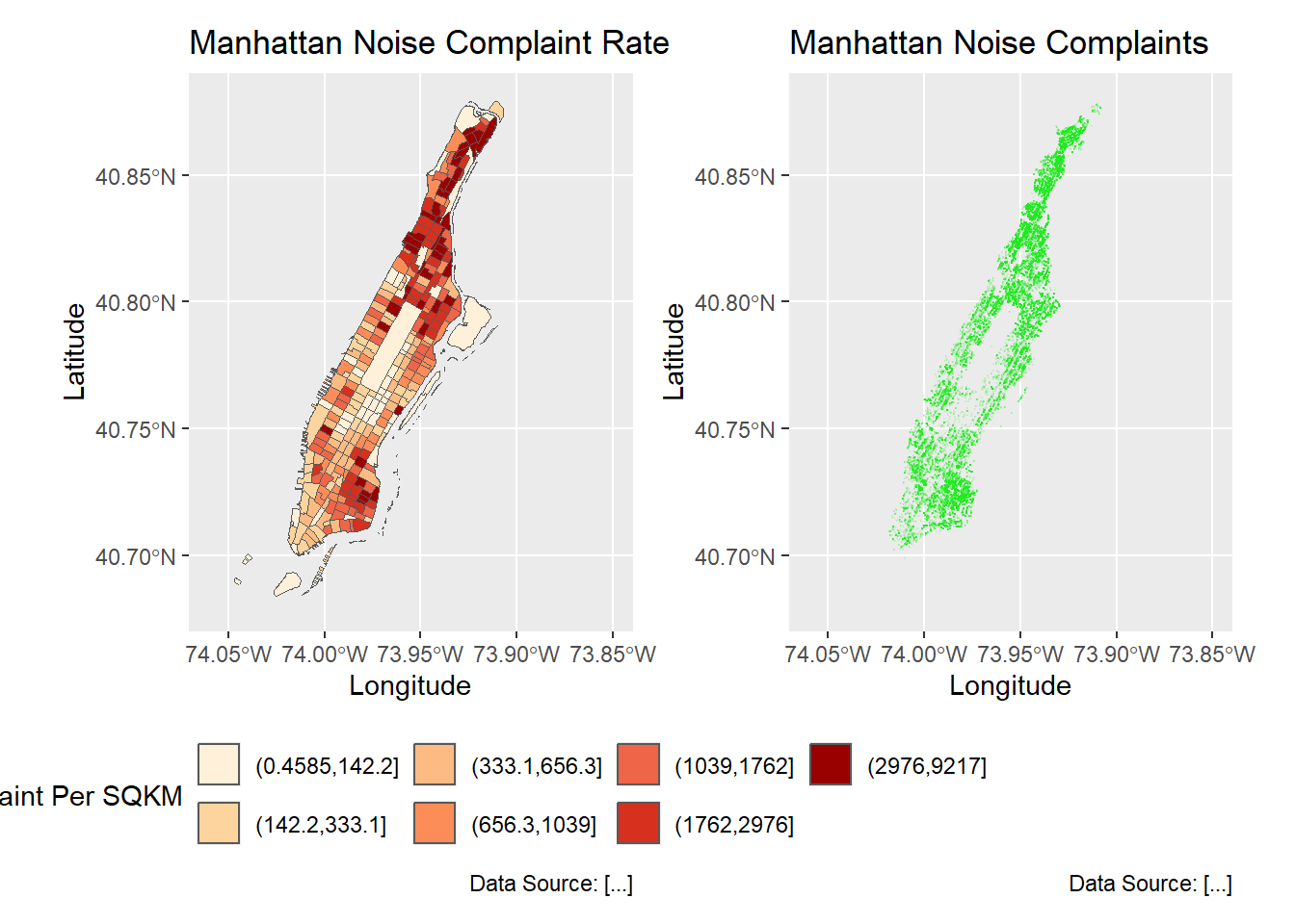
For sf object, the facet also works quite well for comparison purposes.
breaks_lmh <- classIntervals(man_noise_rate_sf$noise_rate, n = 3, style = "quantile")
breaks_lmh$brks[1] %<>% magrittr::subtract(0.0001)
man_noise_rate_sf %<>% mutate(noiseLevel = cut(noise_rate,
                                             breaks_lmh$brks,
                                             labels = c('Low','Medium','High')))

ggplot(man_noise_rate_sf) +
  geom_sf(data = man_noise_rate_sf %>% st_geometry(), col = rgb(0.6,.6,.98)) +
  geom_sf(aes(fill=noise_rate_cat)) +
  #geom_sf(data=man_noises_pt, colour=ptColor, size=0.1) +
  scale_fill_brewer(palette = "OrRd", name='Noise Complaint Per SQKM') +
  labs(title='Manhattan Noise Complaint Rate',
       caption = 'Data Source: [...]') +
  facet_wrap(~noiseLevel)+
  theme(axis.text.x = element_blank(),
        axis.text.y = element_blank(),
        legend.position = 'bottom');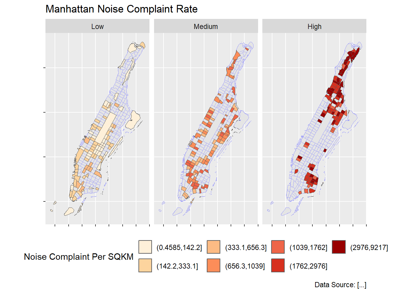
3.4 Choropleth with tmap
tmap is specifically designed to make creation of thematic maps more convenient. It borrows from the ggplot syntax and takes care of a lot of the styling and aesthetics. This reduces our amount of code significantly. We only need:
tm_shape()where we provide- the sf object (we could also provide an
SpatialPolygonsDataframe)
- the sf object (we could also provide an
tm_polygons()where we set- the attribute variable to map,
- the break style, and
- a title.
tmap is still not working well on Mac computers due to some incompatibility issues in some underlying packages/frameworks. Try to use a PC for this part. Or go to the next part.
library(tmap)
tm_shape(man_noise_rate_sf) +
  tm_polygons("noise_rate",
              style="quantile",
              title="Manhattan \nNoise Complaint \nper sqkm")
#> #> ── tmap v3 code detected ───────────────────────────────────────────────────────#> [v3->v4] `tm_polygons()`: instead of `style = "quantile"`, use fill.scale =
#> `tm_scale_intervals()`.
#> ℹ Migrate the argument(s) 'style' to 'tm_scale_intervals(<HERE>)'
#> [v3->v4] `tm_polygons()`: migrate the argument(s) related to the legend of the
#> visual variable `fill` namely 'title' to 'fill.legend = tm_legend(<HERE>)'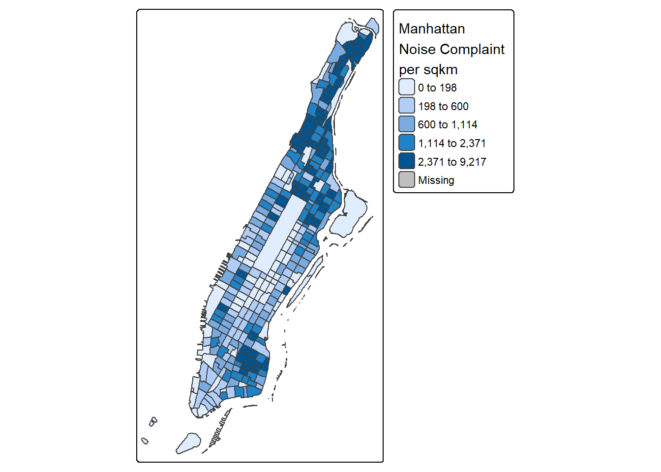
tmap has a very nice feature that allows us to give basic interactivity to the map. We can switch from “plot” mode into “view” mode and call the last plot, like so:
Cool huh?
The tmap library also includes functions for simple spatial operations, geocoding and reverse geocoding using OSM. For more check vignette("tmap-getstarted").
3.5 Web mapping with leaflet
leaflet provides bindings to the ‘Leaflet’ JavaScript library, “the leading open-source JavaScript library for mobile-friendly interactive maps”. We have already seen a simple use of leaflet in the tmap example.
The good news is that the leaflet library gives us loads of options to customize the web look and feel of the map.
The bad news is that the leaflet library gives us loads of options to customize the web look and feel of the map.
Let’s build up the map step by step.
First we load the leaflet library. Use the leaflet() function with an sp or __Spatial__ object and pipe it to addPolygons() function. It is not required, but improves readability if you use the pipe operator %>% to chain the elements together when building up a map with leaflet*.
And while tmap was tolerant about our AEA projection of man_noise_rate_sf, leaflet does require us to explicitly reproject the sf object.
#> Coordinate Reference System:
#>   User input: WGS 84
#>   wkt:
#> GEOGCRS["WGS 84",
#>     DATUM["World Geodetic System 1984",
#>         ELLIPSOID["WGS 84",6378137,298.257223563,
#>             LENGTHUNIT["metre",1]]],
#>     PRIMEM["Greenwich",0,
#>         ANGLEUNIT["degree",0.0174532925199433]],
#>     CS[ellipsoidal,2],
#>         AXIS["latitude",north,
#>             ORDER[1],
#>             ANGLEUNIT["degree",0.0174532925199433]],
#>         AXIS["longitude",east,
#>             ORDER[2],
#>             ANGLEUNIT["degree",0.0174532925199433]],
#>     ID["EPSG",4326]]
# reproject, if needed
# man_noise_rate_sf <- st_transform(man_noise_rate_sf, 4326)
leaflet(man_noise_rate_sf) %>%
addPolygons()To map the homicide density we use addPolygons() and:
- remove stroke (polygon borders)
- set a fillColor for each polygon based on
noise_rateand make it look nice by adjusting fillOpacity and smoothFactor (how much to simplify the polyline on each zoom level). The fill color is generated using leaflet’scolorQuantile()function, which takes the color scheme and the desired number of classes. To constuct the color schemecolorQuantile()returns a function that we supply toaddPolygons()together with the name of the attribute variable to map.
- add a popup with the
noise_ratevalues. We will create as a vector of strings, that we then supply toaddPolygons().
pal_fun <- colorQuantile("YlOrRd", NULL, n = 5)

p_tip <- paste0("GEOID: ", man_noise_rate_sf$GEOID);

p_popup <- paste0("<strong>Noise Complaint Density: </strong>",
                  man_noise_rate_sf$noise_rate%>%round(3)%>%format(nsmall = 3),
                  " /sqkm",
                  " <br/>",
                  "<strong> Number of Noise Complaints: </strong>",
                  man_noise_rate_sf$n_noise,
                  sep="")

leaflet(man_noise_rate_sf) %>%
  addPolygons(
    stroke = FALSE, # remove polygon borders
    fillColor = ~pal_fun(noise_rate), # set fill color with function from above and value
    fillOpacity = 0.8, smoothFactor = 0.5, # make it nicer
    popup = p_popup)  # add popup
Here we add a basemap, which defaults to OSM, with addTiles()
leaflet(man_noise_rate_sf) %>%
  addPolygons(
    stroke = FALSE,
    fillColor = ~pal_fun(noise_rate),
    fillOpacity = 0.8, smoothFactor = 0.5,
    popup = p_popup) %>%
  addTiles()
Lastly, we add a legend. We will provide the addLegend() function with:
- the location of the legend on the map
- the function that creates the color palette
- the value we want the palette function to use
- a title
leaflet(man_noise_rate_sf) %>%
  addPolygons(
    stroke = FALSE,
    fillColor = ~pal_fun(noise_rate),
    label = p_tip,
    fillOpacity = 0.8, smoothFactor = 0.5,
    popup = p_popup) %>%
  addTiles() %>%
  addLegend("bottomright",  # location
            pal=pal_fun,    # palette function
            values=~noise_rate,  # value to be passed to palette function
            title = 'Manhattan Noise Complaints <br> per sqkm') # legend title
The labels of the legend show percentages instead of the actual value breaks6.
To set the labels for our breaks manually we replace the pal and values with the colors and labels arguments and set those directly using brewer.pal() and breaks_qt from an earlier section above.
leaflet(man_noise_rate_sf) %>%
  addPolygons(
    stroke = FALSE,
    fillColor = ~pal_fun(noise_rate),
    fillOpacity = 0.8, smoothFactor = 0.5,
    label = p_tip,
    popup = p_popup) %>%
  addTiles() %>%
  addLegend("bottomright",
            colors = brewer.pal(7, "YlOrRd"),
            labels = paste0("up to ", format(breaks_qt$brks[-1], digits = 2)),
            title =  'Manhattan Noise Complaints <br> per sqkm')
That’s more like it. Finally, a layer control is added to switch to another basemap and turn the polygons off and on. Take a look at the changes in the code below. At the same time, the polygon layer and its legend have the group name. As such, both can be turned on and off at the same time.
polyHighlightOption <- leaflet::highlightOptions(opacity = 1.0, fillColor = 'black')
polyLabelOption <- leaflet::labelOptions(opacity = 0.6)

htmlMap <- leaflet(man_noise_rate_sf) %>%
  addPolygons(
    stroke = FALSE,
    fillColor = ~pal_fun(noise_rate),
    fillOpacity = 0.8, smoothFactor = 0.5,
    popup = p_popup,
    group = "Manhattan",
    label = p_tip,
    highlightOptions = polyHighlightOption,
    labelOptions = polyLabelOption) %>%
  addCircleMarkers(radius = 0.02, weight = 1,
             data = man_noises_pt %>% sf::st_sample(size=2000) %>%
               sf::st_set_crs(4326) %>% sf::st_cast("POINT"),
             group = "NYC noises") %>%
  addTiles(group = "OSM") %>%
  addProviderTiles("CartoDB.DarkMatter", group = "Carto") %>%
  addLegend("bottomright",
            group = "Manhattan",
            colors = brewer.pal(7, "YlOrRd"),
            labels = paste0("up to ", format(breaks_qt$brks[-1], digits = 2)),
            title = "Manhattan <br> Noise Complaints <br>(/sqkm)") %>%
  addLayersControl(baseGroups = c("OSM", "Carto"),
                   overlayGroups = c("Manhattan", "NYC noises")) %>%
  hideGroup(c("NYC noises"))

htmlMap
Such interactive maps can be saved using either htmlwidgets::saveWidget() or mapview::mapshot() The htmlwidgets::saveWidget method can also save tmap output.
# A single file
htmlwidgets::saveWidget(htmlMap, 'nyc_noise_leaflet_widget.html')
# A HTML file with underlying libraries
htmlwidgets::saveWidget(htmlMap, 'nyc_noise_leaflet.html',
                        selfcontained = FALSE, libdir = 'widget-lib')

# Using mapview: which is exactly as the self-contained html from htmlwidges.
# They use the same package and method under the hood.
mapview::mapshot(htmlMap, 'nyc_noise_mapview.html')
If you’d like to take this further here are a few pointers.
Here is an example using ggplot, leaflet, shiny, and RStudio’s flexdashboard template to bring it all together.
3.6 Animated maps
One useful column in the noise point data is the reported time, which can be used to generated an animated map to show the dynamics over time.
require(gganimate)

# Let's show one day's noise complaints
#baseMapExt <- c(-74.06, 40.691, -73.85, 40.885)

# First we create a regular ggplot
#ggmap::get_stamenmap(baseMapExt, zoom = 12, messaging = FALSE, maptype = 'terrain-background') -> baseMap;

man_day_noise_sf <- st_read(dsn = './data/nyc/man_data.gpkg',
        layer='manhattan_noise_one_day')

man_noise_anim <- man_day_noise_sf %>%
                mutate(datetime = lubridate::ceiling_date(datetime, 'minutes')) %>%
                arrange(datetime)  # sort the data by time

#ggmap(baseMap) +
ggplot2::ggplot(data = sf::st_read("./data/nyc/nyc_census_tracts.shp") %>%
                  dplyr::filter(COUNTYFP == '061')) +
      geom_sf(fill="lightgrey", color="grey", show.legend = FALSE) +
      geom_sf(data = man_noise_anim,
              aes(color = descriptor, group = datetime),
              show.legend = TRUE,
              inherit.aes = FALSE) +
      labs(title='Noise Complaint', subtitle = '2019-04-19') +
      theme(axis.title.x=element_blank(),
            axis.title.y = element_blank()) -> p1

p1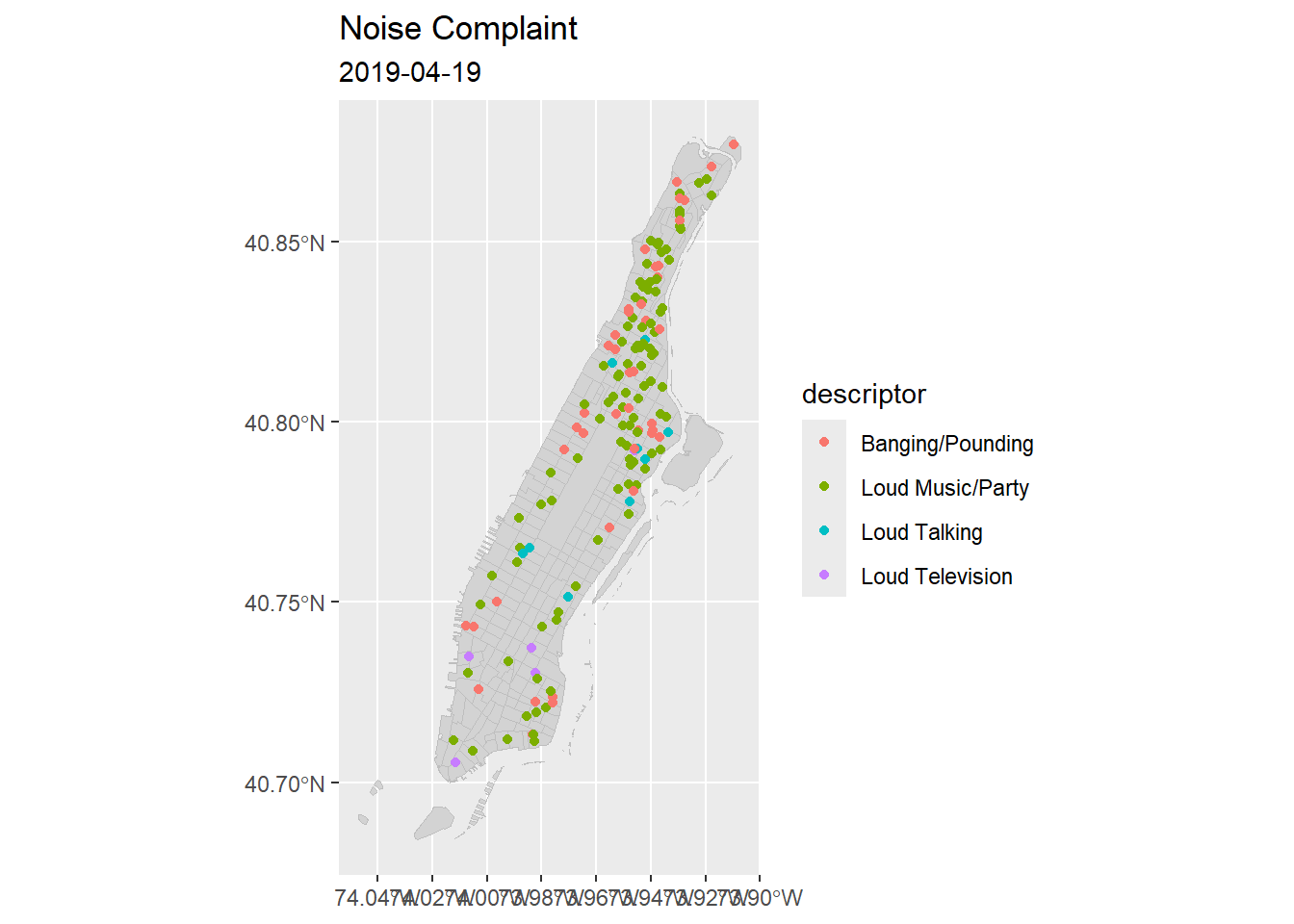
# use gganimate package to add transitions
p1 + transition_time(datetime) +
  shadow_mark() +
  #shadow_wake(wake_length = 0.18, size=NULL, alpha = 0, ) +
  #enter_fade() + enter_grow() + exit_fade() +
  ggtitle('Noise Complaint', subtitle = '{frame_time}') -> panim

# Now produce the animation
# define a device to specify the size of the layout
gganimate::animate(panim, nframes = 180,
        device = 'png', width = 600, height = 600, units = 'px')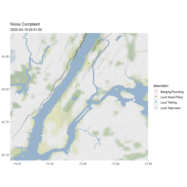
(#fig:man_noise_animation)Manhattan Noise Animation
3.7 Lab Assignment
The third and last R-spatial lab is to visualize data that we assembled during the first two labs. As geovisualization is often exploratory, you are encouraged to be more creative.
Main tasks for the third lab are:
- Plot at least two high-quality static maps with one using the COVID-19 data and one using a related factor. You can use either
plotmethod for sf orggplotmethod.
- Use ggplot2 and other ggplot-compatible packages to create a multi-map figure illustrating the possible relationship between COVID-19 confirmed cases or rate and another factor (e.g., the number of nursing homes, number of food stores, neighborhood racial composition, elderly population, etc.). The maps should be put side by side on one single page. Add graticule to at least one of those maps and label some of the feature on the map where applicable and appropriate.
- Create a web-based interactive map for COIVD-19 data using tmap, mapview, or leaflet package and save it as a HTML file.
Although data visualization has many subjective factors, try your best to make the visuals as appealing as possible.
This is not the only way to provide color palettes. You can create your customized palette in many different ways or simply as a vector of hexbin color codes, like
c( "#FDBB84" "#FC8D59" "#EF6548").↩︎For more details see Chaps 2 and 3 in Applied Spatial Data Analysis with R. Also,
spplotis a wrapper for thelatticepackage, see there for more advanced options.↩︎For the correction of breaks after using classIntervals with spplot/levelplot see here http://r.789695.n4.nabble.com/SpatialPolygon-with-the-max-value-gets-no-color-assigned-in-spplot-function-when-using-quot-at-quot-r-td4654672.html↩︎
See Wilkinson L (2005): “The grammar of graphics”. Statistics and computing, 2nd ed. Springer, New York.↩︎
Google now requires an API key. Cloudmade maps retired its API so it is no longer possible to be used as basemap.
RgoogleMapsis another library that provides an interface to query the Google server for static maps.↩︎The formatting is set with
labFormat()and in the documentation we discover that: “By default,labFormatis basicallyformat(scientific = FALSE,big.mark = ',')for the numeric palette,as.character()for the factor palette, and a function to return labels of the formx[i] - x[i + 1]for bin and quantile palettes (in the case of quantile palettes, x is the probabilities instead of the values of breaks).”↩︎