Designing Maps with
ArcGIS
Part I: Modify a map layout
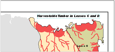
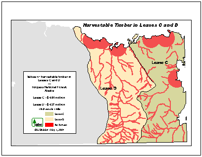
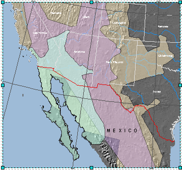
In this exercise,
you will design a map to present the results of the analysis you performed in
the previous module. The map will show the areas that can be harvested in the
timber leases of interest in the
You will
modify an existing layout to create the map you need.
Estimated
time to complete: 40 minutes
Step 1 Start ArcMap and open a map document
Start
ArcMap and open LeasesCD.mxd from your Lab14\Leases
folder.
Step 1: Start ArcMap and open a map
document.
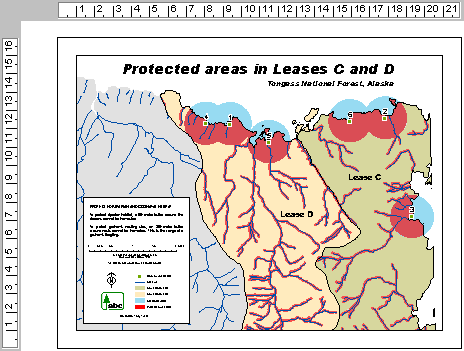
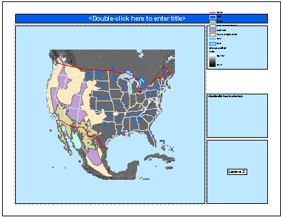
The map opens
in layout view. You see the
If you
can't see the entire layout in the map area, on the Layout toolbar, click the
Zoom Whole Page button ![]() .
.
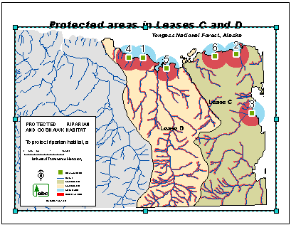
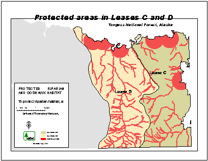
The layout
you see is for a poster-size map, intended for presentation to a conservation
group. It contains many of the elements required for your new map, so rather
than starting from scratch, you will modify the layout to create the report
map.
To
determine what changes need to be made, consider the differences in audience,
purpose, and use between the existing and the new layouts:
|
|
Existing Layout |
New Layout |
|
Audience |
Conservation
group |
Timber
company management |
|
Purpose |
Show
areas in leases C and D that are protected and cannot be harvested |
Show
areas in leases C and D that can be harvested and the value of timber in each
lease |
|
Use |
Presentation
map |
Part of
a report |
Step 2 Define a new output medium
(printer)
The
default printer settings in the department labs are immutable. For the rest of
the lab exercise to work, you have to define a new printer at the MS Windows
level.
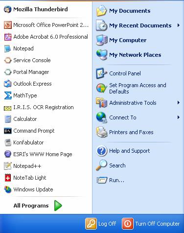
Press the
Windows start button ![]() and click Printer and Faxes.
and click Printer and Faxes.
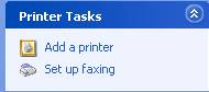
Step 2a: Define a new printer.
In the new
window that will inevitably pop up, select either Add Printer from the File
menu or choose the Add a Printer button among the Printer Tasks on the left sidfe of the new Printers and Faxes window.
Step 2b: Define a new printer.
Click
yourself through the welcome screen of the Add Printer Wizard, select the lower
of the two option buttons to add a network printer and acknowledge your choice
by clicking the Next button again. Browse for a printer and click the Find
Printer button. Select the HP Laser Jet 4050 PCL (1090-B2) on hurricane and
work yourself to the end of the Add Printer Wizard.
Now that
you have defined a new printer, you can go on to change your page settings.
Step 2 Create a copy of the original map
document
Before you
modify the original layout, it's a good idea to create a copy. This way, you
preserve the integrity of the original, while editing
the copy.
From the File
menu, choose Save As.
In the
Save As dialog, navigate to your Lab14\Leases folder and save the map
document as Report.mxd.
Step 3 Change the page settings
In this
step, you will make sure that your map will fit on the letter-size paper
specified for the report. You will do this by setting the map page size, which
also affects the map design.
From the
File menu, choose Page and Print Setup.
In the
dialog, examine the preview graphic shown at the bottom right.
If your
computer is connected to a printer and your default printer paper size is
letter (8.5 x 11), the preview shows that only a small portion of the map fits
on the paper. The map will not print properly because the specified map page is
larger than the printer paper.
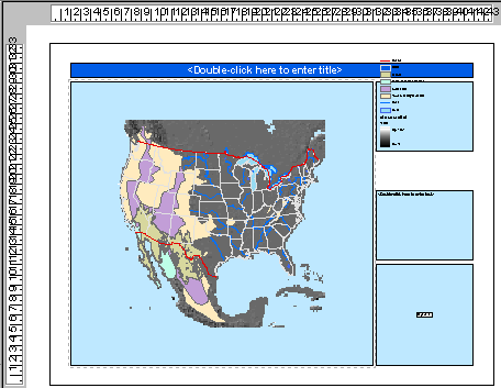
Step 3a: Change the page settings.
In the Map Page Size area of the dialog, notice that the layout's size
is set to ANSI C.
This means that the map is designed to be printed on 22 x 17-inch paper.
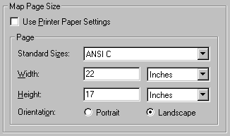
Step 3b: Change the page settings.
Move the
dialog so you can see the layout.
Notice
that the horizontal and vertical rulers also show these dimensions.
Step 3c: Change the page settings.
You will change
the page size to one appropriate for your new map.
In the Map
Page Size area, in the Standard Sizes dropdown list, scroll up and choose
Letter. Make sure the Landscape orientation option is selected.
Then click
the check box Use Printer Paper Settings to have the map size match the printer
size. Notice that the Width and Height fields are updated.
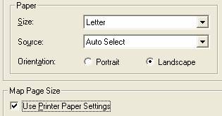
Step 3d: Change the page settings.
Examine
the preview graphic again.
If your
default printer paper orientation is portrait, the preview graphic shows that
the map will not print properly because the map is wider than the paper.
Step 3e: Change the page settings.
You can
fix this by changing the printer settings.
In the
Paper area of the dialog, choose:
- Size: Letter
- Source: the appropriate
setting for your printer
- Orientation: Landscape
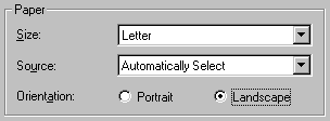
Step 3f: Change the page settings.
Once more,
examine the preview graphic.
This time,
the map page and printer paper image should match.
Step 3g: Change the page settings.
Click OK.
Notice
that the layout rulers are updated to show the new page dimensions.

Step 3h: Change the page settings.
Before
making any more changes, save the map document.
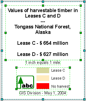
Step 4 Resize the data frame
Your
printed map is going to be included in a bound report, so the layout needs to take
into account the additional space required for the binding. The binding will
reduce the available space on the layout.
To
accommodate the binding, you will increase the upper margin by resizing the
data frame.
With the
Select Elements button ![]() ,
click in the empty space to the left of the map title to select the data frame.
,
click in the empty space to the left of the map title to select the data frame.
Step 4a: Resize the data frame.
Tip: If you inadvertently select the wrong map element, click
anywhere in empty white space to unselect it. If you accidentally move an
element, click Undo ![]() to return it to its original position.
to return it to its original position.
Drag the
data frame's top-middle handle down so that the upper edge is at about 7.5 on the
vertical ruler. Don't worry if the data frame cuts across the map title—you
will fix this later.
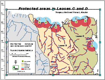
Step 4b: Resize the data frame.
In the next
step, you will change the extent shown in the data frame.
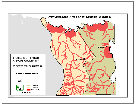
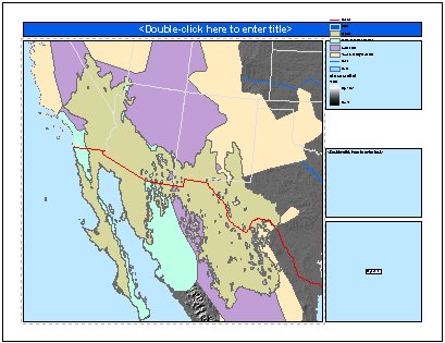
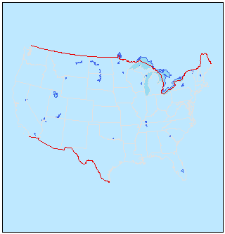
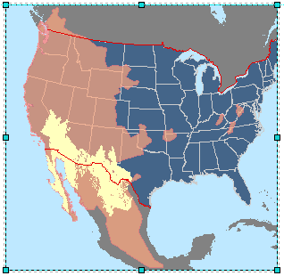
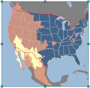
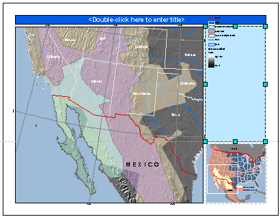
Step 5 Change the map extent
In your
map, the two timber lease areas are of primary interest to the audience, but
they are currently cut off at the bottom. To fix this, you will change the map scale
and then pan the data frame.
For this
map, you will use a scale of 1:63,360. This particular scale was chosen because
the leases can be shown in their entirety in the data frame, and also because
this scale is equivalent to 1 inch equals 1 mile (an inch on the map is equal
to a mile on the ground). This is a common and easily understood map scale.
In the
scale box, replace the current scale with 63,360.
Pan ![]() the map so that the leases are not cut off at
the bottom.
the map so that the leases are not cut off at
the bottom.
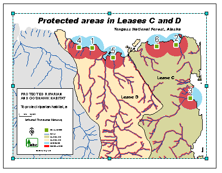
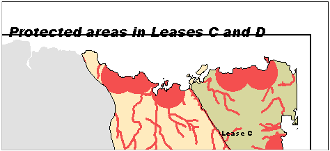
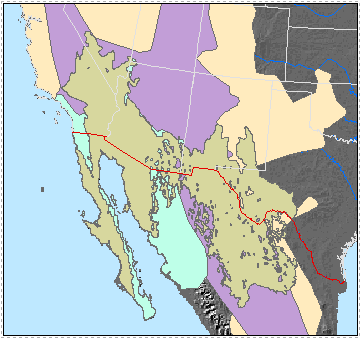
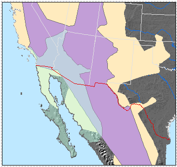
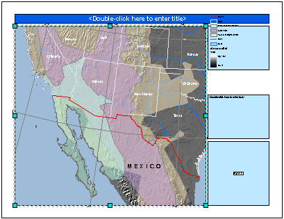
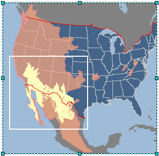
Your
layout should resemble the View Result graphic below.
Step 5: Change the map extent.
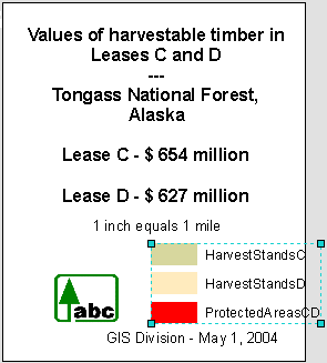
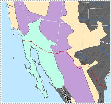
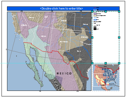
Step 6 Choose the layers
In this
step, you will choose the layers to display in your map by considering whether
the information they convey supports the layout's purpose, is suitable for
presentation to the intended audience, and is appropriate for display at this
size and scale.
Examine
the data shown in the layout. Do you think all of the layers should be included
on the new map?
Using the
information in the table below, in the Table of Contents, turn off the layers
that will not be included on the map.
|
Layer |
Include on map? |
Reason |
|
GoshawkNestsCD |
No |
Irrelevant
information for this audience |
|
LeaseOutlinesCD |
Yes |
Accentuates
the perimeter of the lease areas |
|
Streams |
No |
Too much
detail for display at this scale |
|
ProtectedAreasCD |
Yes |
Highlights
the display of the harvestable timber areas |
|
NestBuffersCD |
No |
Irrelevant
information for this audience |
|
HarvestStandsC |
Yes |
The
map's purpose is to show this information |
|
HarvestStandsD |
Yes |
The
map's purpose is to show this information |
|
GeneralArea |
Yes |
Helps to
locate the leases in the general area |
Notice
that, on the layout, the legend updates.
Step 6: Choose the layers.
Your
layout now shows only the information that supports the map purpose and is
simpler than the original layout. The smaller page size and the scale of this
layout require less complexity.
By
simplifying the layout, you have made it easier for the audience to read and
understand the map.
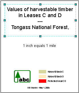
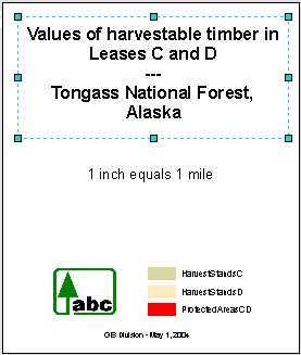
Step 7 Change the map title
In this
step, you will change the map title to one that's more appropriate for the new
map.
With the
Layout toolbar's Zoom In tool ![]() ,
zoom in more closely to the title. Make sure you can see the whole title and
the upper-right corner of the page.
,
zoom in more closely to the title. Make sure you can see the whole title and
the upper-right corner of the page.
To make
more space for the new map title, you will delete the subtitle. Later, you will
add text to the layout that includes the information provided by the subtitle.
With the
Select Elements tool, select the subtitle ("
Step 7a: Change the map title.
With the
Select Elements tool, double-click the title. In the Properties dialog's Text
tab, if necessary, replace the existing text with Harvestable Timber in
Leases C and D.
Click OK.
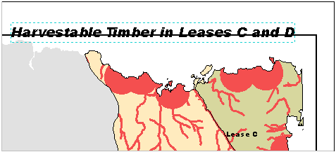
Step 7b: Change the map title.
The
title's font size is too large for this layout.
With the
map title still selected, on the Draw toolbar, click the Font size dropdown
arrow and change the size to 18.
Move the
title down to the white space above the lease areas.
Step 7c: Change the map title.
Save your
work.
Step 8 Adjust the border symbol and map
text
The data
frame's border is too thick for this layout, so you will change it.
Click the
Zoom Whole Page button ![]() .
With the Select Elements tool, select the data frame.
.
With the Select Elements tool, select the data frame.
Right-click
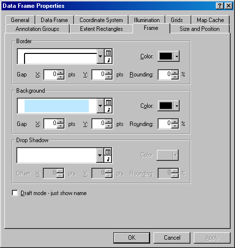
inside the data frame and choose Properties. In the
Data Frame Properties dialog, click the Frame tab.
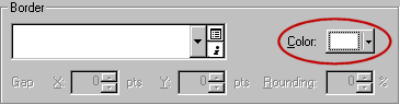
Click the
down arrow next to Border, then click the 1.5 Point
line.
Click OK.
To see the
new line thickness that was applied to the border, click outside the data frame
to unselect it.
Step 8a: Adjust the border symbol
and map text.
Next,
consider the lease name map text. The lease area names are useful information,
so you will keep them. However, the Lease C text is too close to the lease
area's edge. You will move it to a better position in the layout.
With the
Select Elements tool, select the Lease C text. Drag it to the position shown in
the graphic below:
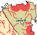

Step 8b: Adjust the border symbol
and map text.
Click
outside the data frame to unselect the text. Save your work.
Step 9 Delete elements and replace the scale
bar
In this
step, you will turn your attention to the information box in the lower left
corner of the layout. You will delete some elements you don't need and add an
element.
With the
Layout toolbar's Zoom In ![]() tool, drag a box around the entire information
box to zoom in to it.
tool, drag a box around the entire information
box to zoom in to it.
Depending
on the size of your ArcMap window, the elements shown in the View Result
graphic below may look different on your screen—you may see more or less
detail. That's OK.
Step 9a: Delete elements and
replace the scale bar.
Notice
that the scale of the rulers is also magnified.
For this
layout, the north arrow and map projection text are unnecessary, so you will
delete them. Also, because your map uses a standard scale, you will replace the
scale bar with descriptive scale text.
Click the
Select Elements tool, hold down your Shift key, then
click the map projection text, scale bar, and north arrow to select them all.
Press Delete.
Step 9b: Delete elements and
replace the scale bar.
Now you
will add the scale text.
From the
Insert menu, choose Scale Text.
In the
Scale Text Selector, click Inches = Miles.
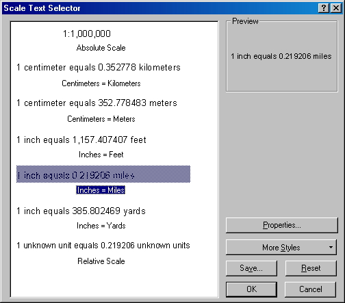
Step 9c: Delete elements and
replace the scale bar.
Click OK.
The scale
text is inserted.

Step 9d: Delete elements and replace
the scale bar.
Notice
that the word "miles" is plural. Because your scale
is singular (1 mile), the "s" doesn't make sense. To fix this
problem, you will convert the scale text to a graphic that you can edit.
![]() About converting map elements to a graphic
About converting map elements to a graphic
On a layout, a scale bar and scale text are dynamically
linked to a data frame. That is, the numbers shown in the scale bar and scale
text reflect the scale that has been set for the data frame they're associated
with. When the data frame's scale is changed, the scale bar and scale text will
automatically update. The legend is also dynamically linked to a data frame. If
you turn a layer off in the Table of Contents, its symbol and label will
disappear from the legend on the layout.
There are times, however, when you will want to modify an
element linked to the data frame. You may want to more precisely position
individual parts of it, for example. Converting the element to a graphic allows
you to modify it.
When you convert a dynamically linked map element to a
graphic, the link to the data frame is broken and cannot be reestablished.
Before converting a scale element to a graphic, therefore, make sure the data
frame is at the scale you want for the final map. Before converting a legend to
a graphic, make sure that all the layers you want it to show are turned on in
the Table of Contents, symbolized the way you want, and named or labeled the
way you want.
Right-click
the scale text and choose Convert to Graphics (notice that when you do this,
the selection handles disappear).

Step 9e: Delete elements and
replace the scale bar.
Right-click
the scale text and choose Properties. In the Properties dialog, delete the
"s" in the word "miles."
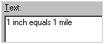
Step 9f: Delete elements and
replace the scale bar.
Click OK.
Step 9g: Delete elements and
replace the scale bar.
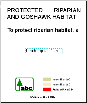
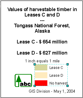
Step 10 Modify the descriptive text
Now you
will modify the text at the top of the information box. This text is
inappropriate for this map and it is too large.
With the
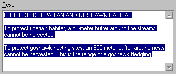
Select Elements tool, double-click over the "PROTECTED RIPARIAN
AND..." text.
A
Properties dialog opens.
Step 10a: Modify the descriptive
text.
Delete the
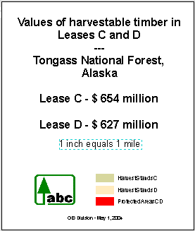
current text. Copy the text below and paste it into the Properties dialog.
|
Values
of harvestable timber in Leases C and D |
Click ![]() to center the text.
to center the text.
Click OK.
Step 10b: Modify the descriptive
text.
The
original text was intended for the presentation map, so its size is too large
for the report map.
On the
Draw toolbar, change the font size to 12 and, to make it more visible, click
the Bold button ![]() .
.
Step 10c: Modify the descriptive
text.
The text
looks good now, but you can't see it all. You need to resize the text box that
contains the text.
Drag the
lower-middle handle down until you can see all the text. Unselect the text box.
Now select
the scale text and move it to just below the descriptive text.
Step 10d: Modify the descriptive
text.
Finally,
select the line of text at the bottom of the information box and change its
size to 10. Don't worry about aligning it; you will do this later.
Step 10e: Modify the descriptive
text.
Save your
work.
Step 11 Modify the legend
The legend
shows the layers that you chose earlier, but the legend labels are too small to
read. You will enlarge them by resizing the whole legend.
Select the
legend, then drag the upper-right handle diagonally up
and to the right, until the text looks about as large as the font in the scale
text.
Step 11a: Modify the legend.
Now you
will change the legend's label text so that it's easier to understand.
In the
Table of contents, rename HarvestStandsC to Lease
C.
Notice
that the legend is dynamically updated and shows the new layer name.
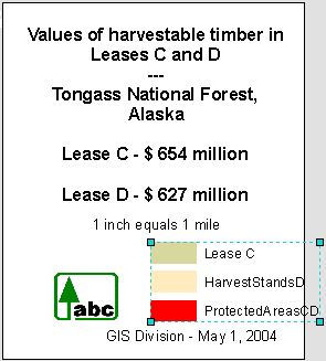
Step 11b: Modify the legend.
Use the
same procedure to change the other legend labels as shown below.
|
HarvestStandsD |
Lease
D |
|
ProtectedAreasCD |
No
harvest |
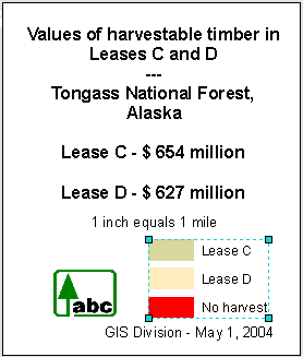
Step 11c: Modify the legend.
Next, you
will reposition and align the elements in the information box.
Step 12 Group and align map elements
Now that
you have all the elements you need in the information box, you will reposition
and align them relative to each other.
Select the
legend, if necessary, and move it closer to the company logo.
Step 12a: Group and align map
elements.
Press
Shift and click the company logo so both it and the legend are selected.
Right-click
over one of the selected elements and choose Align, then click Align Bottom.
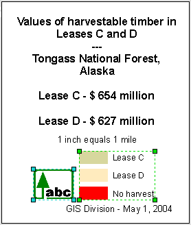
Step 12b: Group and align map
elements.
The two
elements are now aligned relative to each other.
Right-click
over one of the selected elements again and choose Group.
Step 12c: Group and align map
elements.
![]() About grouping elements
About grouping elements
In a layout, aligning and moving elements is a common task
made easier by grouping elements. When you group elements, they are treated as one
object and can be moved together. Grouping is a way to make sure that elements you have aligned relative to one another stay
aligned.
To ungroup a grouped element, first select it, then
right-click and choose Ungroup.
Now you
will select all the elements, then align them.
With the
Select Elements tool, drag a box around the whole information box to select all
the elements within it.
Right-click
over any of the selected elements, choose Align, then
click
Step 12d: Group and align map
elements.
Now group
all of the elements.
You have
finished your work on the information box.
Click
outside the information box to unselect its elements.
Step 12e: Group and align map
elements.
Zoom to
the extent of the whole page ![]() and save your work.
and save your work.
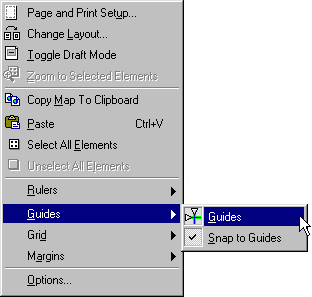
Step 13 Align elements using guides
Currently,
the layout appears visually unbalanced because the information box is too close
to the lower left corner of the layout. To fix this problem, you will move the
box.
To
precisely position the box, you will use ArcGIS guides. Like rulers, guides are
visual aids that do not display in data view, and they are not printed.
Right-click
in the white space just outside the layout, choose
Guides, then click Guides.
Right-click
again in the white space outside the layout and choose Guides, then click Snap
to Guides.
With the
Select Elements tool, click the 1" marker on the top (horizontal) ruler.
A guide
marker (gray arrow) is added to the ruler where you clicked and the guide
itself (cyan dotted line) displays parallel to the layout's left edge.
Step 13a: Align elements using
guides.
Move your
mouse pointer over the marker and pause it until you see the double arrow. Drag
to the right until you see 1.20 inches in the tooltip
that displays at the lower left.
Use the
same method to add a guide at 1.20 on the vertical ruler (the tooltip displays at the same location as before—above on
the left).
Step 13b: Align elements using
guides.
Select the
information box and drag it up and over towards the guides.
Notice
that when you come close to the guides, the box snaps to them.
Step 13c: Align elements using
guides.
Click
outside the layout to unselect the information box.
You no
longer need the guides, so you'll remove them.
Right-click
over the horizontal ruler and choose Clear All Guides.
Right-click
over the vertical ruler and choose Clear All Guides.
The layout
is now more balanced.
Step 13d: Align elements using
guides.
Step 14 Export the map
Now that
you have finished modifying the map, you will export it as an image file. The
image will be inserted into the report document.
From the
File menu, choose Export Map. Navigate to your Design\Leases folder and
export the map as a PDF file with the name Report.pdf.
This is
your backup. Now export the map to a PNG file (Report.png) and save it to your
own public_html
folder. Create a web page and set a link to this PNG file, then send Jing
Li an email telling him, where to look for your final lab submission.
Step 15 Save the map and close ArcMap
Your
design work is done, so save the map document.
If your
computer is connected to a printer, go ahead and print the map if you want to
see what it looks like on hard copy.
Close
ArcMap.
In this
exercise, you adapted an existing layout for a new audience and purpose by
applying some basic cartographic design principles and using tools available in
ArcMap's layout view. These tools automated some of
your work and gave you a great deal of control over the layout's elements.
To create
an effective map, you need to understand its intended audience, its purpose,
and how it will be used. Once you know these things, you can determine the
appropriate data, scale, and other elements needed for the map.
The following
exercise is voluntary. You will not be graded on it – unless you would like to improve your current standing in this
course by some extra credit.
Part
II. Create a presentation map
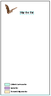
GIS Day is
approaching and you're going to give a presentation called "Map the
Bat" at a local high school. You plan to create a presentation map that
shows the ranges of three bat species and their relationship to each other and
to the desert ecoregion that is their common habitat.
In this
exercise, you will create a basic map layout by applying a map template and
designing the main data frame. You will continue by creating other map elements
and fine-tuning the layout. You will finish the map by creating an inset map,
modifying the template and the legend, and adding scale information and other
elements to the layout.
Estimated
time to complete: 70 minutes
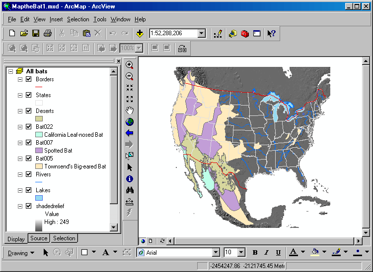
Step 1 Start ArcMap and open a map
document
Start
ArcMap and open MaptheBat1.mxd from your Lab14\Bats folder.
Step 1: Start ArcMap and open a map
document.
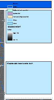
The map
shows the ranges of three bat species (California Leaf-nosed bat, Spotted bat, Townsend's Big-eared bat) as they extend across
the
Besides
the bat ranges, the map contains some base layers as well as a raster layer
called shadedrelief that shows elevation. The Deserts
layer shows the southwestern desert habitat that is common to all three
species.
For
convenience, the layers are already in the correct order and most of the
symbols are defined.
Step 2 Apply a template to the layout
To speed
up the design process, you will apply a predefined map template that contains
most of the elements you will need for your presentation map.
First,
click the Layout View button ![]() below the map display.
below the map display.
To apply a
more suitable template to your layout, on the Layout toolbar, click the Change
Layout button ![]() .
.
In the
General tab, you see a list of available templates and on the right, their
preview image. ArcMap provides a variety of templates suitable for different
layouts.
Click LandscapeModernInset.mxt.
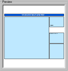
Step 2a: Apply a template to the
layout.
This
template contains a number of predesigned elements
and will work well for your map.
Click
Next.
Step 2b: Apply a template to the
layout.
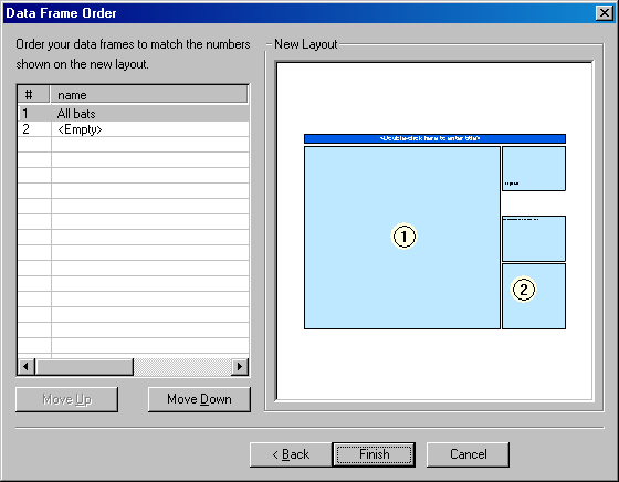
The
template includes boxes for two data frames. The All bats data frame is
selected for the main data frame (data frame 1), while the second data frame is
intended for an inset map.
The inset
map box is currently empty because you haven't created the inset map data frame
yet. The template includes a map title and some other elements that you will
create in the next exercise.
Click
Finish. If you don't see the layers in the main data frame, click Refresh ![]() .
.
Step 2c: Apply a template to the
layout.
Notice
that a second data frame was added to the bottom of the Table of Contents (you
might need to scroll down to see it). Later, this data frame will contain the
layers for the inset map.
Step 3 Enlarge the page size
Remember,
the map is intended for a presentation. It will be seen by a lot of people from
a distance, so it should be fairly large in size.
From the
File menu, choose Page and Print Setup. In the Map Page Size area,
in the Standard Sizes dropdown list, choose ANSI E (44 x 34 inches).
Click OK.
Step 3: Enlarge the page size.
The layout
rulers show the new page dimensions.
You have
made considerable changes to the map, so save your work.
Step 4 Set the map scale
The
presentation will concentrate on the area of the bat ranges that overlap the southwestern
desert, which is the extent of the Deserts layer. You will change the extent
shown in the data frame as well as the map scale so that this area is the focus
of the data frame.
In the
Table of Contents, right-click Deserts and choose Zoom To
Layer.
Step 4a: Set the map scale.
Notice
that the map scale is a large number that is hard to read and understand. To
make it more user-friendly, you will round it.
Change the
scale to 1:3,000,000.
![]()
Step 4b: Set the map scale
If
necessary, pan ![]() the map so that the Deserts layer is centered
in the data frame.
the map so that the Deserts layer is centered
in the data frame.
Step 5 Lock the scale
To
safeguard against inadvertently changing the map scale as you work on the layout
by using the wrong zoom tool, you will fix the current scale so that it can't
be changed.
Click the
Select Elements button ![]() ,
then right-click in the data frame and choose Properties. In the Data Frame
Properties dialog, click the Data Frame tab.
,
then right-click in the data frame and choose Properties. In the Data Frame
Properties dialog, click the Data Frame tab.
The extent
is currently set to Automatic.
Click
Fixed Scale.
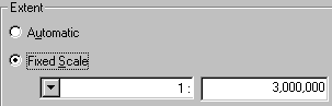
Step 5a: Lock the scale.
Click OK.
On the
Tools toolbar, notice that the Zoom In, Zoom Out, and Full Extent buttons are
now disabled.
Step 5b: Lock the scale.
Click away
from the data frame to unselect it and save your work.
Step 6 Choose the data frame layers
The main
data frame is currently confusing and difficult to read—it contains too much
information. You will fix this problem by turning off unneeded layers and
making others partially transparent.
To see the
data frame as clearly as possible, zoom in on it ![]() to maximize its size in the map display area.
to maximize its size in the map display area.
Step 6a: Choose the data frame
layers.
The map
shows how the bat species extend across the southwestern desert, but the
Deserts layer obscures the bat ranges. For your map, showing the bat ranges is
of primary importance, so you will turn off the Deserts layer and display it in
the inset map.
In the
Table of Contents, turn off the Deserts layer.
Step 6b: Choose the data frame
layers.
Now the
bat ranges are unobstructed.
Save your
work.
Step 7 Adjust layer transparency
Because
the bat ranges are symbolized with a solid fill, each layer obscures the one
below it. If you make them partially transparent, you will be able to see the underlying
layers.
Right-click
in the gray area next to the Help menu and click Effects.
You see
the Effects toolbar.
![]()
Step 7a: Adjust layer transparency.
Dock the
Effects toolbar on your ArcMap window if desired.
In the
Layer dropdown list, choose the Bat022 layer. Click the Adjust Transparency button ![]() .
.
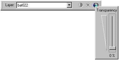
Step 7b: Adjust layer transparency.
Drag the
Transparency slider up to 50%.
Step 7c: Adjust layer transparency.
Now the
layer is transparent and you can see the underlying layers through it.
Make the
Bat007 and Bat005 layers 50% transparent as well.
Step 7d: Adjust layer transparency.
The base
layers that were obscured by the bat ranges are now visible.
Adjusting layer
transparency is a good way to optimize the information shown in a map. In
addition to seeing each bat range, you can now also see:
- The relationship of bat ranges to each other
- The state or country that a bat range traverses
- The physical features underlying the bat ranges
- The part of the southwestern desert that is habitat
for all three bat species
Close the
Effects toolbar and zoom out to the full extent of the page ![]() .
Save your work.
.
Save your work.
Step 8 Convert labels to annotation
Showing
the state outlines in the map is useful for orientation, but the map could be
improved by adding the state names. You will add state name labels.
Double-click
the States layer to open its Layer Properties dialog. Click the Labels tab.
Check the
option to "Label features in this layer." For Label Field, choose
STATE_NAME.
Modify the
default label symbol using the information below:
- Font: Arial
- Font size: 38 (type 38
into the size box)
- Font color: White
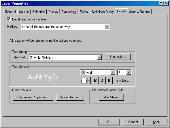
Step 8a: Convert labels to
annotation.
Click OK.
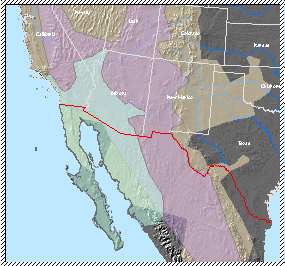
Some of
the labels intersect bat range outlines as shown in the graphic below.
You will
move the problem labels. In order to move individual labels, however, you need
to convert the layer's dynamic labels to annotation.
Right-click
States and choose Convert Labels to Annotation. In the dialog, check the option
to store the annotation in the map.
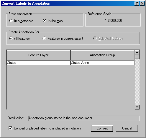
Step 8b: Convert labels to
annotation.
Click
Convert.
There is
no apparent change to the map, but the state names are now annotation that you
can edit.
The data
frame is selected in the layout, but in order to edit annotation, you must give
the data frame "focus."
On the
Layout toolbar, click the Focus Data Frame button ![]() .
.
Step 8c: Convert labels to
annotation.
The
diagonal hatched symbol around the data frame indicates that it is focused.
With the
Select Elements tool, click each piece of annotation to select it, then drag it to the new position shown in the graphic below.
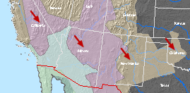
Click
outside the data frame to remove the focus and unselect the annotation. Click
the Refresh button ![]() at the bottom of the map display area.
at the bottom of the map display area.
Save your
work.
Step 9 Add new text
In this
step, you will add the country name for
Zoom in to
the part of
On the
Draw toolbar, type 60 into the font size box and press Enter. Click the
Bold (B) button.
Click the
New Text button ![]() ,
click in the center of the data frame, then type
,
click in the center of the data frame, then type
Double-click
If the
country name intersects one or more of the bat range outlines, reposition it so
that it's entirely within a bat range.
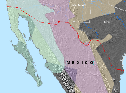
Step 9: Add new text.
Zoom out
to the whole page. Unselect the annotation and save your work.
Next, you
will add a reference system to the data frame.
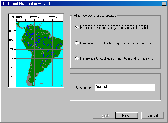
Step 10 Add a graticule
To make it
easier to understand the extent covered by the bat ranges, you will add a graticule to the map.
Because
you will use a wizard to create the graticule, you
need to make sure that wizards are enabled.
From the
Tools menu, choose Options. In the General tab, make sure the option to
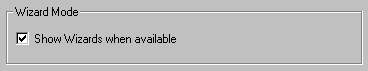
"Show Wizards when available" is checked.
Step 10a: Add a graticule.
Click OK.
Right-click
the data frame and choose Properties. Click the Grids tab.
Click New
Grid.
In the
Grids and Graticules Wizard, click the available
options and preview the types of grids you can create.
Click the
option to create a graticule.
Step 10b: Add a graticule.
Click
Next.
In the
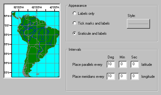
Appearance area, choose Graticule and labels.
Graticule
lines labeled with latitude and longitude will be shown in the map.
Click the
button under Style and in the Symbol Selector, change
the color to Gray 50%.
Click OK.
You want
the map to display a 10° x 10° graticule.
In the Intervals area, in the box under Deg (degrees) type 10
for the parallels.
Press Tab.
Click in
the Deg box next to meridians and type 10, then press Tab.
Notice
that the preview has updated.
Step 10c: Add a graticule.
Click
Next.
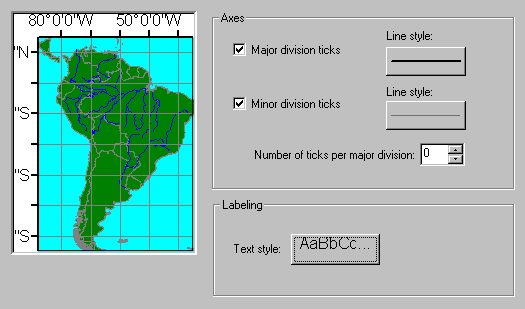
In the
Labeling area, click the Text style button. Change the font size to 12, then click OK.
Step 10d: Add a graticule.
Click
Next. The graticule is set up the way you want it, so
click Finish.
The graticule option is now checked in the Data Frame
Properties dialog.
Click OK.
The graticule is added to the data frame.
Step 10e: Add a graticule.
Unselect
the data frame and zoom in if necessary to see the graticule
better.
The graticule also is useful for showing which direction is
north. The projection used for this map causes north to vary from one area to
another, so it would not be appropriate to add a north arrow to this map.
Zoom in to
the middle of the data frame's left border and examine the graticule's
label.
Step 10f: Add a graticule.
To reduce
the amount of space occupied by the labels, you will change the orientation of
the labels on the left and right side of the data frame so they're drawn
vertically (parallel to the border).
Reopen the
Data Frame Properties dialog. In the Grids tab, click Properties.
In the
Reference System Properties dialog, click the Labels tab. In the Label
Orientation area, check the Left and Right boxes.
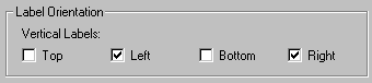
Step 10g: Add a graticule.
Click OK.
Click OK
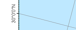
again to close the Data Frame Properties dialog.
The label
is now oriented vertically.
Step 10h: Add a graticule.
Save your
work.
Step 11 Change the background color
The last
thing you will do is change the data frame's backgound
color.
Zoom to
the whole page.
Once more,
open the Data Frame Properties dialog. This time, click the Frame tab.
Step 11a: Change the background
color.
Click the
dropdown arrow next to Background and choose any color (e.g., Black).
Click
Apply.
Now the
colors in the Background box and the Color box are the same.
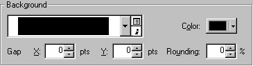
Step 11b: Change the background
color.
Click the
Color box and choose Blue Gray Dust.
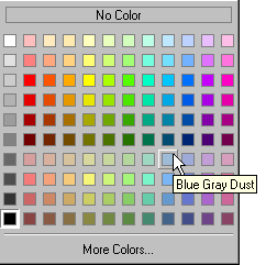
Click OK.
Step 11c: Change the background
color.
Step 12 Save your work
You have
now made all the changes to the main data frame.
Save your
work.
Step 13 Add the layers for the inset map
When you applied the map template, a second data frame (Layers 2) was added
to the Table of Contents. It is currently empty. In this step, you will decide
which layers to use and add them to the inset map data frame.
The inset
map needs to show the relationship between the bat ranges, the
First, in
the Table of Contents, rename the Layers 2 data frame to Inset map.
For the
inset map, consider the following:
- Base map information can be
shown by adjusting the symbology of the States
and Lakes layers, so you will use them.
- The shadedrelief
and Rivers layers show more detail than is necessary, so you won't use
them.
- To show the broader area in
which the study area is located, you will add a new layer that shows
- Instead of displaying a
separate range for each bat species (it's more detail than you need in an
inset map), you will add a new layer that shows all bat ranges together.
- The desert ecoregion
inhabited by the bat species is shown in the Deserts layer, so you will
use this layer.
Based on
the above, copy the layers that you will use from the All
bats data frame and paste them into the Inset map data frame.
Step 13a: Add the layers for the
inset map
On the
layout, zoom in ![]() to the Inset map data frame.
to the Inset map data frame.
Step 13b: Add the layers for the
inset map.
In the
next step, you will add the remaining layers and symbolize them.
You won't
be working with the All bats data frame, so collapse
it.
Step 14 Add and symbolize layers in the
inset map
Now you
will add the missing layers to the inset map and symbolize them.
With the
Select Elements tool ![]() ,
click the Inset map data frame to select it.
,
click the Inset map data frame to select it.
Click the
Add Data button ![]() and navigate to Lab14\Bats\BatRanges.mdb.
Add the AllRanges and Countries layers.
and navigate to Lab14\Bats\BatRanges.mdb.
Add the AllRanges and Countries layers.
Turn on
the Deserts layer.
Using the
table and graphic below, apply the symbology listed
for each layer. Remember to display the Effects toolbar to adjust the
transparency of the AllRanges layer.
|
Layer |
Fill Color |
Outline Color |
Outline Width |
Transparency |
|
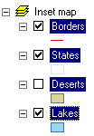
Borders |
|
|
2 |
|
|
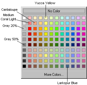
Deserts |
Yucca
Yellow |
|
0 |
|
|
States |
Larkspur
Blue |
Gray 20% |
1 |
|
|
AllRanges |
Cantaloupe |
Medium
Coral Light |
|
30% |
|
Countries |
Gray 50% |
|
0 |
|
In the Table
of Contents, move the Deserts layer above the AllRanges
layer so that it's not obscured.
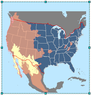
Step 14: Add and symbolize layers
in the inset map.
You've
done a lot of work, so save the map document.
Step 15 Adjust the inset map scale and
extent
Now you
need to set an appropriate scale and extent for the inset map.
Make sure
the Inset map data frame is still selected. Change the scale to 1:18,500,000
To lock
the scale so that it remains constant, open the Data Frame Properties dialog.
In the Data Frame tab, click Fixed scale, then click
OK.
Notice
that that the information inside the data frame conforms to a square shape, and that the data frame itself is almost square. You
will resize the data frame so that it's 9.5 x 9.5 inches. You'll use a guide
and snapping to make this task easier.
Add a
horizontal guide at 11.5 inches (left ruler).
With the
Select Elements tool, drag the data frame's top-middle selection handle down
until it snaps to the guide.
Pan ![]() the map, if necessary, so that
the map, if necessary, so that
Step 15a: Adjust the inset map
scale and extent.
You no
longer need the guide, so drag the marker off the ruler to remove the guide.
Change the
data frame's background color to Blue Gray Dust to match the All
bats data frame.
Step 15b: Adjust the inset map
scale and extent.
Save your
work.
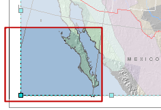
Step 16 Add an extent rectangle and labels
In this
step, you will continue to work with the inset map. You'll add an extent rectangle
to show the study area as well as state and country labels.
Open the
Data Frame Properties dialog and click the Extent Rectangles tab.
Click All
bats (this is the data frame for which you will create the extent rectangle),
then click the right arrow button ![]() to move it to the box on the right.
to move it to the box on the right.
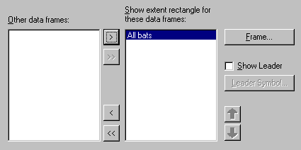
Step 16a: Add an extent rectangle
and labels.
Click
Frame.
In the
Frame Properties dialog, click the Border color box and click White.
Step 16b: Add an extent rectangle
and labels.
Click OK, then OK again to update the layout.
If
necessary, pan the map ![]() to the right so that the extent rectangle is
not cut off.
to the right so that the extent rectangle is
not cut off.
Step 16c: Add an extent rectangle
and labels.
To make the
inset map more informative, add labels for the state and country names using
the settings below:
|
Layer |
Label Field |
Label Symbol |
|
States |
STATE_ABBR |
Arial,
10, Bold, White |
|
Countries |
INSET_NAME |
Arial,
20, Black |

Step 16d: Add an extent rectangle
and labels.
Save your
work.
Step 17 Create a legend for the inset map
To help map
readers understand the symbols in the inset map, you need to create a legend
for the inset map.
The inset
map data frame should still be selected.
From the
Insert menu, choose Legend.
For this
legend, you will use only the Deserts and AllRanges
layers.
In the
Legend Items box, hold down your Ctrl key and click all the other layers. Click
the left arrow button ![]() to remove them.
to remove them.
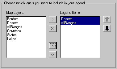
Step 17a: Create a legend for the
inset map.
Click
Next.
You don't
want the inset map legend to have a title.
In the
Legend Title box, delete the word "Legend."
Click
Next.
Move the
Legend Wizard so you can see both it and the inset map data frame.
Click
Preview.
Examine
the legend that is shown near the middle of the data frame.
Click
Finish.
The legend
is added to the inset map.
You will
change the legend labels so they are easier to understand.
In the
Table of Contents, click in the white space to the right of the Deserts symbol.
Click inside the blue patch that displays and type Desert ecoregion. Press Enter.
Add a
label for the AllRanges layer that says Cumulative
bat ranges.
On the
layout, move the inset map legend to the right of the extent rectangle, so that
it's entirely within the
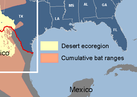
Step 17b: Create a legend for the
inset map.
The design
work on the inset map is now finished.
Zoom out
to the extent of the whole layout page ![]() .
Save your work.
.
Save your work.
Step 18 Modify the template
Besides
the two data frames that you have already worked on, the layout contains two
boxes above the inset map. For this layout, you need only one of the boxes.
Zoom in
closely to the two boxes.
Step 18a: Modify the template.
Click the
box immediately above the inset map to select it. Hold down your Ctrl key and
select the text element that is inside the box.
Press
Delete to remove them from the layout.
Next, you will
add a guide to which you will snap the remaining box when you resize it. You
want the distance between the resized box and the inset map to be the same as
the distance between the two data frames.
The
distance is about 0.40 inches, so add a horizontal guide at 11.80 on the left
ruler.
Tip: To make sure you're adding a guide at 11.80, look at the tooltip that displays below the top ruler when you click to
add the guide. You may need to pan up on the page ![]() to see the guide.
to see the guide.
Zoom to
the extent of the whole page.
Select the
box and drag its bottom edge down until it snaps to the guide. Its top edge should
remain aligned with the top edge of the All bats data
frame.
Step 18: Modify the template.
Now you
will change some of the box properties so that the elements you place inside it
will be as legible as possible.
Right-click the box to open the Properties dialog.
Click the
Frame tab and make these changes:
|
Border |
2.5
Point, Black |
|
Background |
Hollow |
Step 18c: Modify the template.
Save your
work.
Step 19 Modify the All bats legend
By
default, the All bats data frame legend shows the
symbols for all the layers. These are more than you need to show, so you will
modify the legend to show only the symbols for the bat species.
First,
zoom in to the box.
With the
Select Elements tool, select the legend and move it to the bottom of the box.
Step 19a: Modify the All bats
legend.
Now you
will remove the layers you don't need.
Right-click
the legend and choose Properties.
In the
Legend Items box, hold down your Ctrl key and click all the layers, except for
the three bat range layers (Bat022, Bat007, Bat005).
Click the
left arrow button ![]() to remove them.
to remove them.
Click OK.
Step 19b: Modify the All bats
legend.
Save your
work.
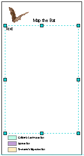
Step 20 Add a logo, subtitle, and
informative text
To the box
that contains the legend you will add a logo, a subtitle for the map, and
informative text about the bats that are the subject of this presentation.
First, you
will add the logo.
From the
Insert menu, choose Picture.
Navigate
to the Lab14\Bats folder and add bat_logo.gif.

Step 20a: Add a logo, subtitle, and
informative text.
Move the
logo near the upper left corner of the box.
Now you
will add the subtitle.
On the
Draw toolbar, click the New Text tool ![]() .
Click to the right of the logo and add the text Map the Bat. Press
Enter.
.
Click to the right of the logo and add the text Map the Bat. Press
Enter.
Move the
text, if necessary, to align it with the logo's bottom edge.
Step 20b: Add a logo, subtitle, and
informative text.
To show
how unique the three bat species are, you will add informative text about them
in the empty space below the logo and subtitle.
Copy all
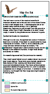
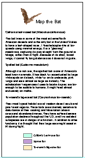
the text from the box below.
|
This bat
lives in some of the most extreme North American deserts and is the only bat
in the Spotted
bat (Euderma maculatum) Although
it is not rare, the spotted bat is one of Townsend's
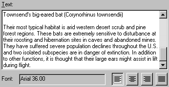
big-eared bat (Corynorhinus townsendii)
Their
most typical habitat is arid western desert scrub and pine forest regions.
These bats are extremely sensitive to disturbance at their roosting and
hibernation sites in caves and abandoned mines. They have suffered severe
population declines throughout the |
There's quite a lot of text that you want to fit into a
rectangular space.
Click the
dropdown arrow next to the New Text tool and click the New Rectangle Text tool ![]() .
.
Draw a
rectangle about 0.5 inches inside the box borders, below the logo and subtitle,
and above the legend.
Step 20c: Add a logo, subtitle, and
informative text.
Double-click
the text rectangle to open the Properties dialog.
In the
Text tab, press Ctrl+v to paste the bat text. Align
the text to the left.
Step 20d: Add a logo, subtitle, and
informative text.
Click OK.
If you
don't see all the text on the layout, on the Draw toolbar, change the font size
to 24. At that size, you should be able to see all of it.
Step 20e: Add a logo, subtitle, and
informative text.
You have
now created all the elements for the box. Resize, align, and move them until
you're satisfied with their arrangement. Group elements as
needed.
When
you're finished, unselect all elements.
The View
Result graphic below shows one possible way of arranging the elements.
Step 20f: Add a logo, subtitle, and
informative text.
Zoom to
the whole page and save your work.
Step 21 Add a scale bar
Remove the
guide from the ruler on the left; you don't need it any more.
Select the
All bats data frame, then zoom to the area shown
below.
From the
Insert menu, choose Scale bar, then click Alternating Scale Bar 1.
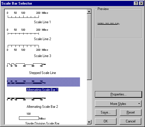
Step 21a: Add a scale bar.
Click
Properties.
In the
Scale and Units tab, in the Scale area, under "When resizing" click the
down arrow and choose Adjust number of divisions.
Notice
that the Division Value field becomes active.
For
Division Value, enter 100. For Division Units, choose Miles.
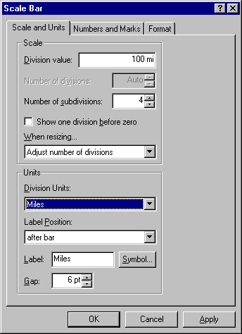
Step 21b: Add a scale bar.
These
settings mean that the scale bar is divided into sections that represent 100
miles. Also, when you resize the scale bar it will change in 100-mile
increments, its division.
Click the
Format tab and change the text size to 14. Change the bar size to 8 (you may
need to type this value).
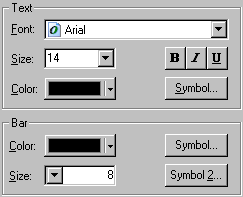
Step 21c: Add a scale bar.
Click OK,
then OK again.
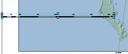
Step 21d: Add a scale bar.
You need
to adjust the scale bar's size and position.
Zoom in if
necessary to see the scale divisions. Resize the scale bar so that it shows 400
miles.
Reposition
the scale bar so that it is centered between the left edge of the data frame
and the
Step 21e: Add a scale bar.
Save your
work.
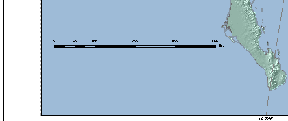
Step 22 Add map source text
In this
step, you will add text with information about the map's data sources, then you will align it with the scale bar.
Copy the
text from the box beneath.
![]() Map source
Map source
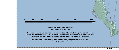
Albers Conical Equal Area projection
North American Datum 1983
The bat range layers were downloaded from the
National Atlas Web site. They were compiled by Bat Conservation International,
Inc., using data from various sources that was originally published in 1981.
The desert ecoregion is derived from the World
Wildlife Fund Terrestrial Ecoregions.
This map was made for the Map the Bat presentation,
using ESRI ArcGIS 9 software.
May 10, 2005
Click the
New Rectangle Text tool and draw a text
Right-click
the text box and choose Properties. In the Text tab, paste the map source text.
Align the
text in the center. Click Change Symbol and change the font size to 14.
Click OK
to close the open dialogs.
If
necessary, enlarge the box so that all the text is visible.
Hold down
your Ctrl key and select the scale bar and map source text. From the Drawing
menu, choose Align, then click
Move the
group so it's about 1 inch inside the data frame borders.
Step 22: Add map source text.
When
you're done, zoom to the whole page and save your work.
Step 23 Create the map title
The last
layout element you will work on is the map title.
Double-click
the map title element and enter Bats of the Southwestern Desert - GIS Day.
Click OK.
Zoom to
the upper-right quarter of the layout.
Select the
title and the text box with the bat information below it.
Align them
on their right side.
Click in
an empty white area to unselect both elements.
Now select
the map title and the blue rectangle behind it.
From the
Drawing menu, choose Align, then click
Now select
just the blue rectangle. On the Draw toolbar, change the fill color ![]() to Black.
to Black.
Unselect
the rectangle and zoom to the whole page.
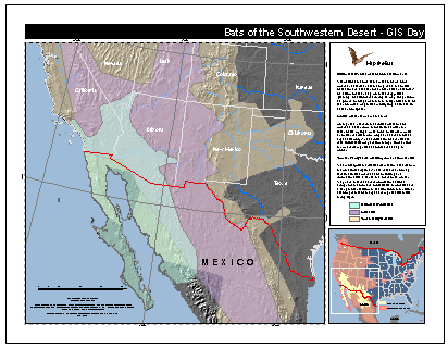
Step 23: Create the map title.
Your
design work is done!
Step 24 Save your work and close ArcMap
You've
finished your layout, so save your work.
As in the
previous exercise, export your map to both a PDF and a PNG file. Set
a link to the PNG file and inform Jing Li about the availability of your lab
submission.
Close
ArcMap.
In this
exercise, you continued to work in the layout environment, concentrating on
creating, fine-tuning, and then balancing the elements for a presentation map.
Some
layout elements, such as the scale bar and legend, are dynamic and automatically
update when you change the data frame they're associated with. Others, such as
the informative text, help the audience to fully understand the map. The layout
you created also contains a purely decorative element, the bat logo.
Review
An
effective map communicates a clear message to its intended audience. In a well
designed map, all the elements work together as a visually balanced composition
that emphasizes and supports the map's main purpose. In ArcGIS, you design a
map by creating a layout in ArcMap.
- Visually, the map body should
be the most prominent element on the map.
- The main elements of a map are
the map body, legend, title, scale, north arrow, and the inset map. Maps can
also contain other elements such as graticules,
text boxes, charts, graphics, and images.
- You can modify the properties
of all the elements in a layout to suit your needs. ArcMap gives you tools
to organize and arrange the elements so that a map is easy to read.
- To increase the information
conveyed by a map and to make a map more readable, you can adjust layer
transparency, convert labels to annotation, and add a reference system.
- To improve a map's visual
balance, you can add graphic elements such as borders and text boxes.
Review
questions
1.
What
are some questions you should ask before creating a map?
2.
When
is a map template especially useful?
3.
What
are some of the tools used to organize and arrange elements in a layout?