|
|
|
Charts or
Graphing |
|
Numbers can usually be represented quicker and to a larger audience in a
picture format. Excel has a chart program built into its main program. The
Chart Wizard ![]() will step you through questions that will
(basically) draw the chart from the data that you have selected. There
are many types of charts. The two most widely used are the bar chart and the
pie chart.
will step you through questions that will
(basically) draw the chart from the data that you have selected. There
are many types of charts. The two most widely used are the bar chart and the
pie chart.
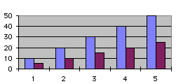 The
BAR Chart is usually used to display a change (growth or decline) over a
time period. You can quickly compare the numbers of two different bar charts to
each other.
The
BAR Chart is usually used to display a change (growth or decline) over a
time period. You can quickly compare the numbers of two different bar charts to
each other.
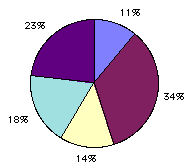 The
PIE Chart is usually used to look at what makes up a whole Something.
If you had a pie chart of where you spent your money you could look at the
percentages of dollars spent on food (or any other category).
The
PIE Chart is usually used to look at what makes up a whole Something.
If you had a pie chart of where you spent your money you could look at the
percentages of dollars spent on food (or any other category).
You can add legends, titles, and change many of the display variables.
|
|
|
Charts or
Graphing |
|
422773